Case study — Collections
A calm store for
considered purchases.
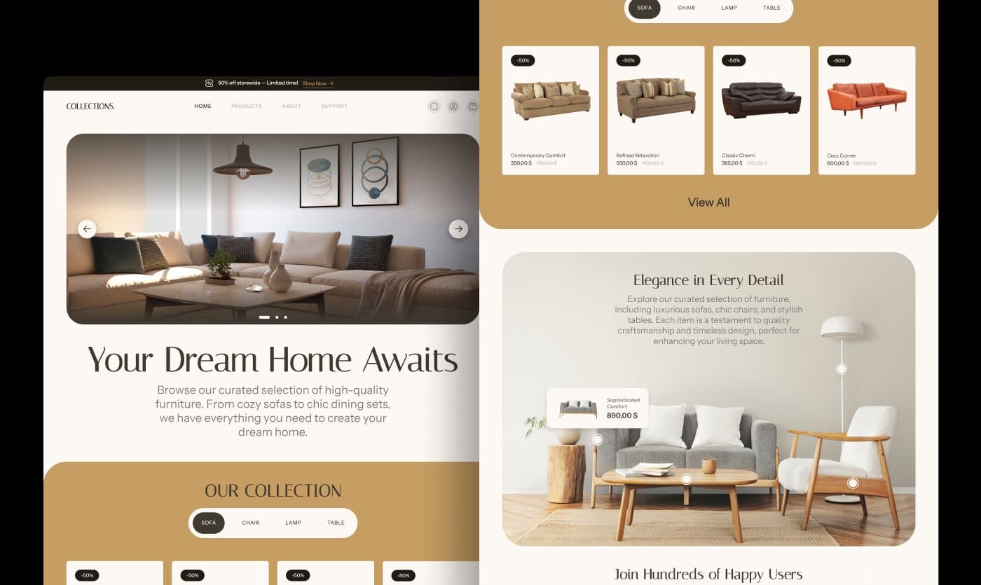
Collections is a furniture eCommerce platform for sofas, chairs, lamps and tables, aimed at homeowners and interior designers who compare carefully before they buy. Editorial typography, a warm neutral palette and generous photography make browsing feel like a catalogue, not a marketplace.
01Context
Browsing as a catalogue,
not a grid.
Italiana for headlines, Instrument Sans for body text and a palette drawn from the products (#FDF9F4 to #1F1B15) set the tone before any UI. Every page was then designed at 1280 and 430 together.
Scope: homepage, products listing with filters, product details, newsletter and footer, with the responsive versions treated as first-class screens rather than a reflow.
Let the product
set the pace.
02Homepage
Hero, collection,
proof, newsletter.
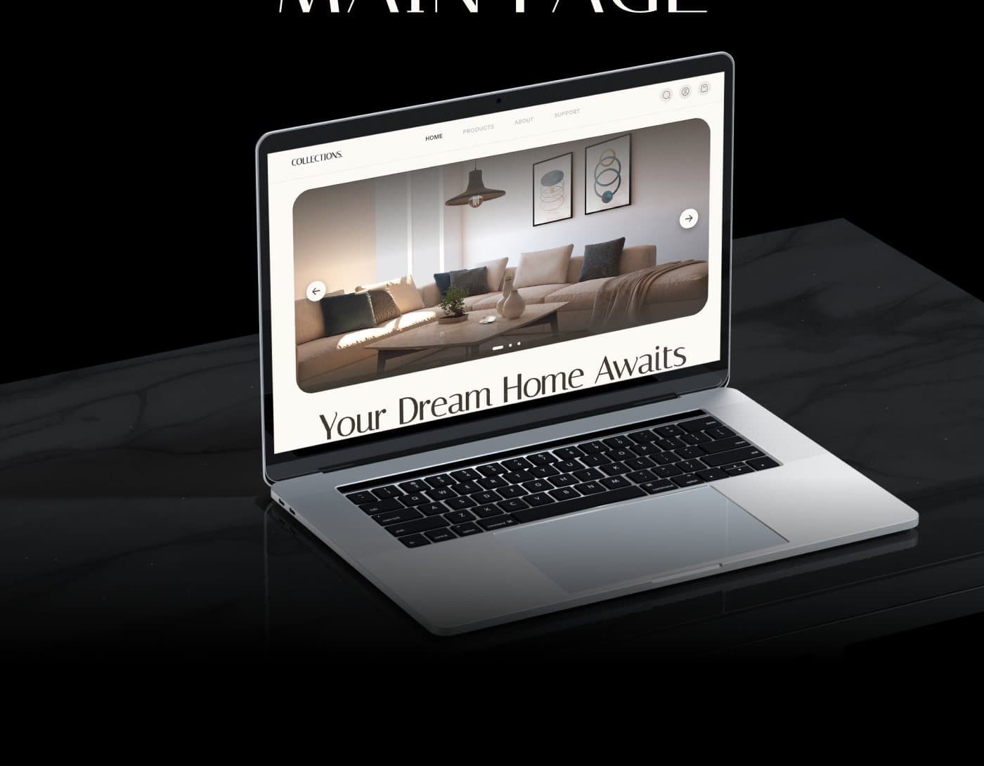
The homepage moves in one direction: a full-width room photo, the collection switcher (sofa, chair, lamp, table), one editorial feature with a shoppable hotspot, customer quotes and a newsletter block. No carousels competing for attention.

03Product listing
Filters on the left,
products in a calm grid.
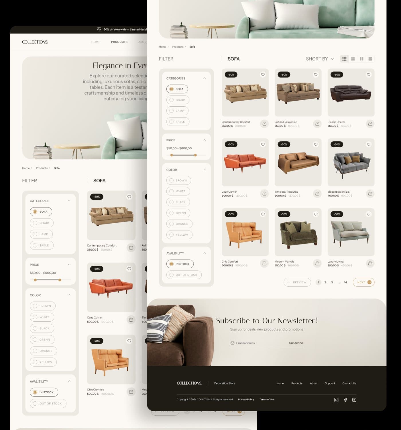
Categories, price range, colour and availability filter a three-column grid with hover wishlist and quick add. On mobile the same filters sit behind a single Filter control above a two-column grid.
04Product details
One decision
per screen.
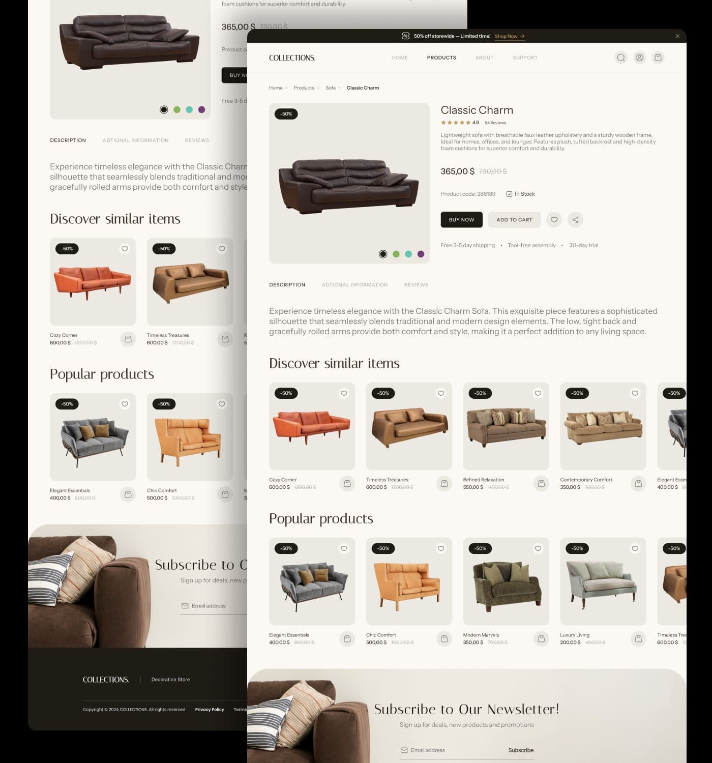
Price, discount, stock, product code and the two actions (Buy now, Add to cart) sit beside the gallery; description, additional information and reviews follow as tabs; similar and popular products close the page.

Next: the mobile experience
05Mobile
Designed from
the phone up.
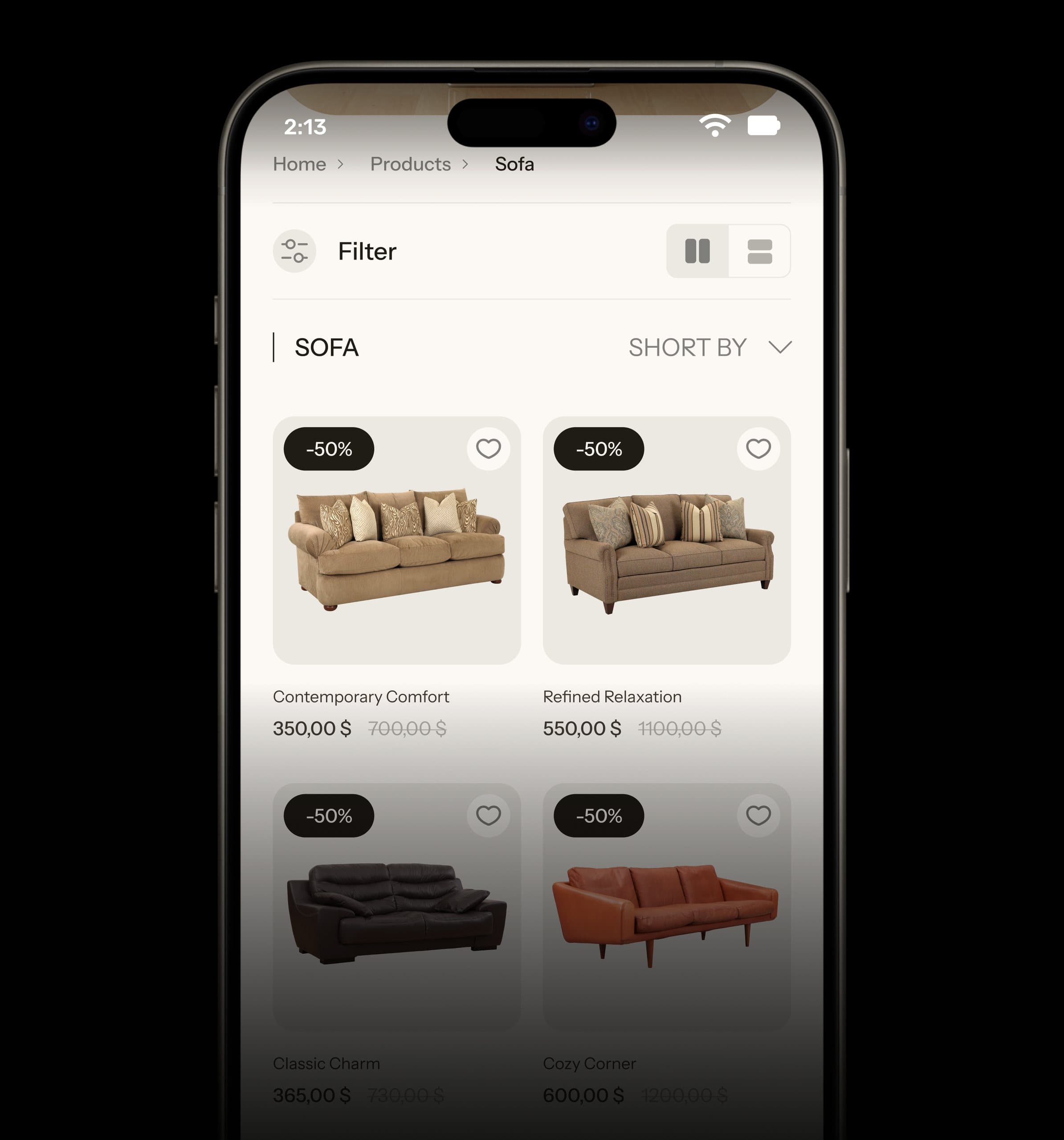
Listing and product pages were composed at 430px first: the hero carousel keeps its dots, filters collapse into a sheet, and the product gallery leads with colour swatches under it.
Quiet design.
Clear decisions.
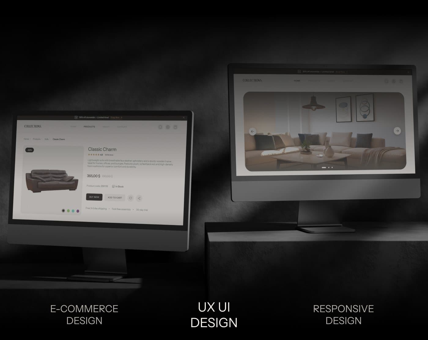
Desktop and responsive versions of the product page, presented together.
More work
More work.
Same level of thinking.
A broader range of eCommerce, SaaS and web projects. SwipeScroll through, open what is relevant.
eCommerce · CRO
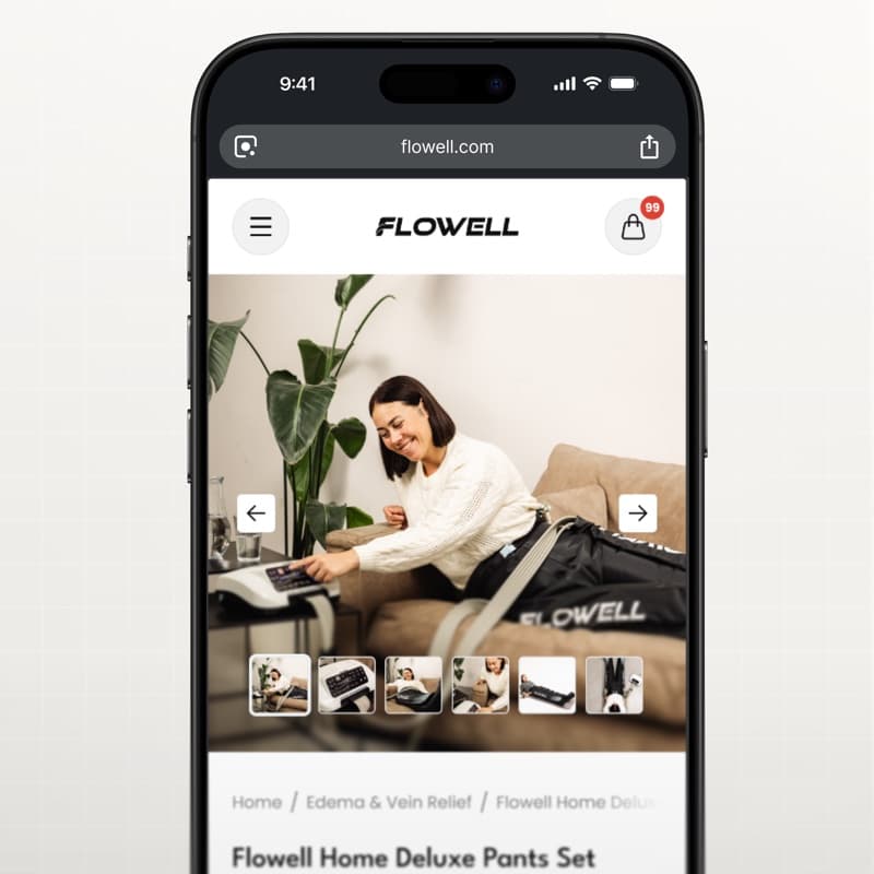
Flowell — eCommerce conversion optimization
Storefront and product pages redesigned around clearer product education and a more confident path to purchase.
View case study Flowell — eCommerce conversion optimization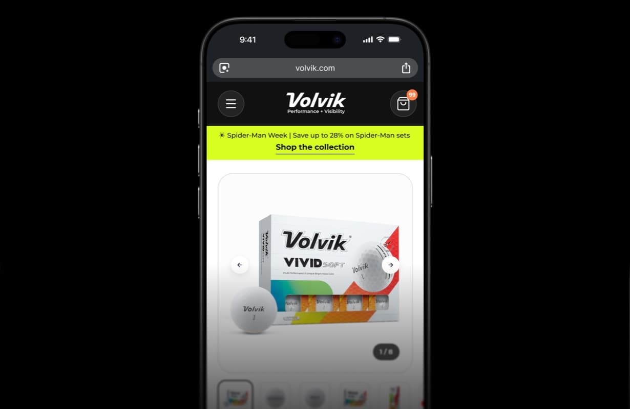
eCommerce · CRO
Volvik — eCommerce PDP redesign & CRO
Product detail page redesign and conversion optimization for a golf brand.
View case study Volvik — eCommerce PDP redesign & CRO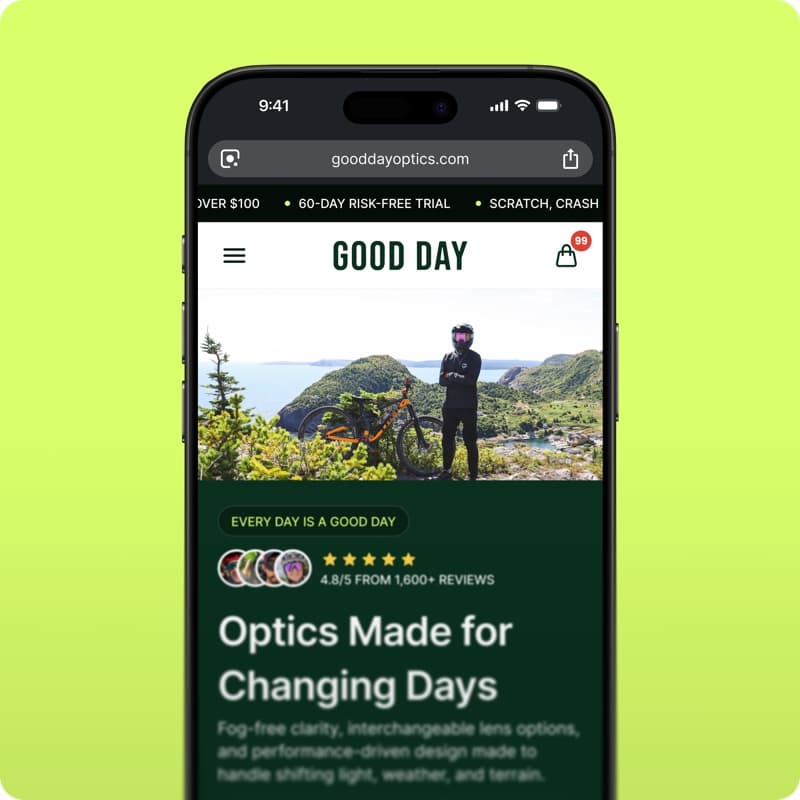
eCommerce · Shopify
GoodDay Optics — Shopify eCommerce redesign
Storefront redesign for an eyewear brand: homepage, collections and product pages built to convert.
View case study GoodDay Optics — Shopify eCommerce redesign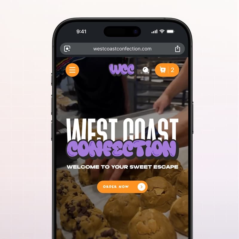
eCommerce · Web design
West Coast Confection — eCommerce website
Playful storefront for a cookie brand: menu, product pages and cart built for quick ordering.
View case study West Coast Confection — eCommerce website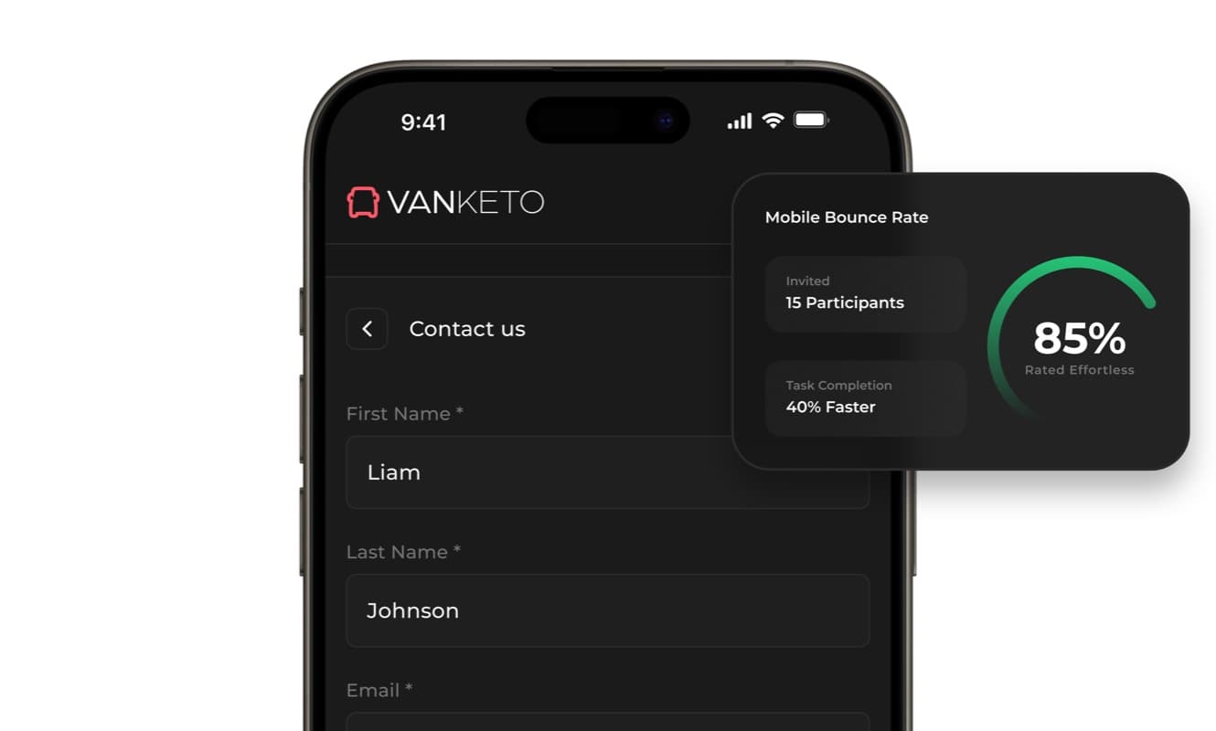
SaaS · Product UX
Vanketo — customer & employee portal
Portal UX/UI for order management: customers track their orders, staff process them, one interface for both.
View case study Vanketo — customer & employee portal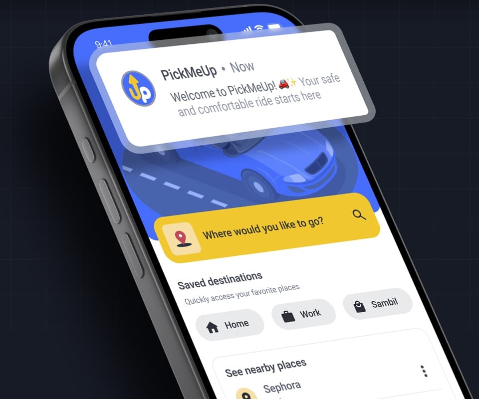
Mobile app · Product design
PickMeUp — ride-hailing app UX/UI
Mobility app case study: destination, car selection and ride flow designed for Venezuela.
View case study PickMeUp — ride-hailing app UX/UI


Have a project with
a similar problem?
Share the product, page or funnel you want to improve. You’ll get a straight answer on fit, scope and timing.
Independent studio — you work directly with Dylan Allynder.