Case study — Volvik
Fewer decisions.
Better ones.
Volvik sells performance golf balls in dozens of models, colours and licensed packs. The product page had to carry model comparison, colour choice, pack sizing and bundles without turning a $35 purchase into homework.
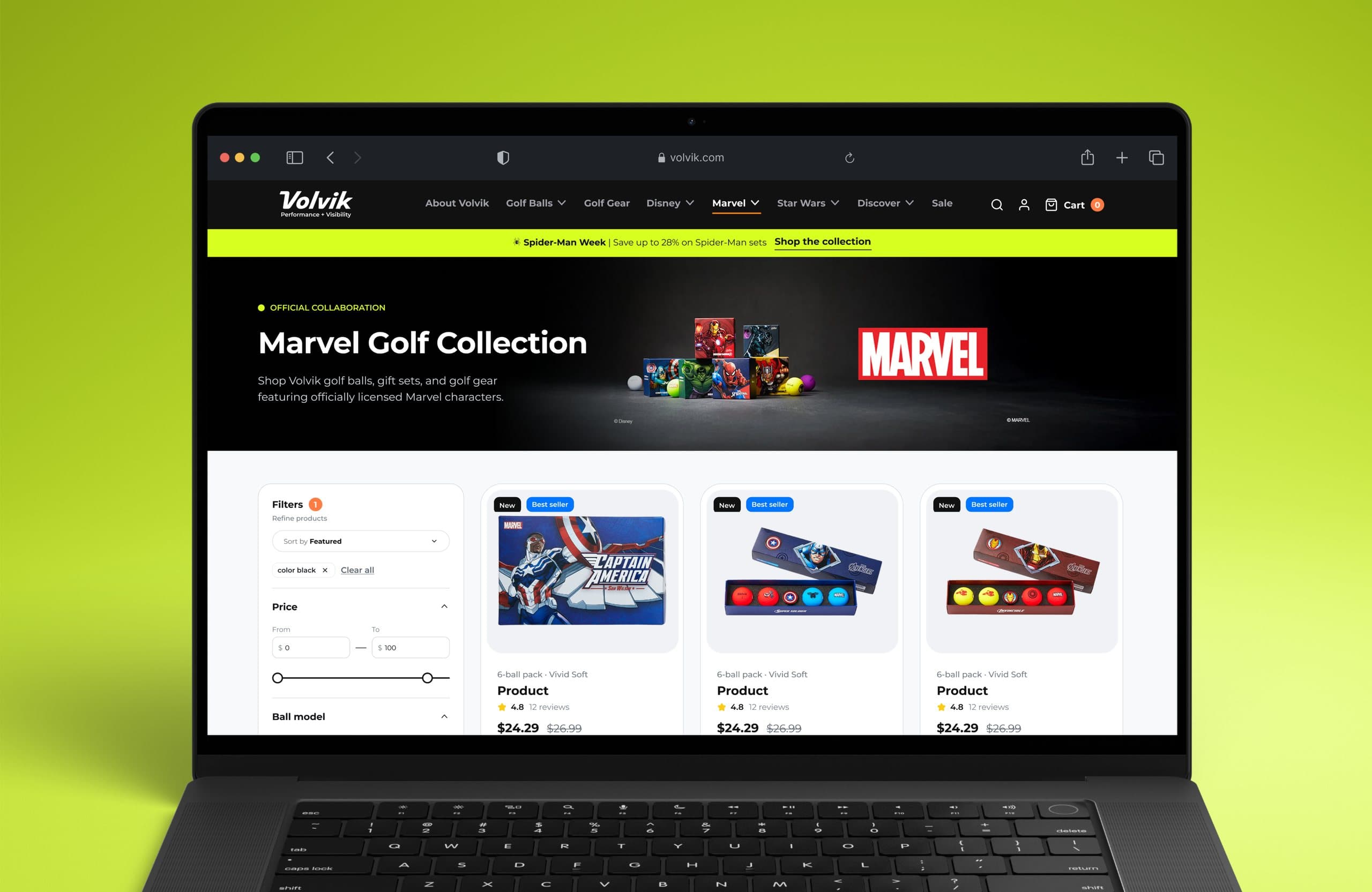
01Context
One ball,
many ways to buy it.
Volvik’s range splits by model (Vivid Soft, Condor, Condor X), by colour, by pack size and by licensed collections such as the Marvel sets. On the original page those choices competed for the same space.
The brief was a product-page redesign with a conversion focus: keep every option available, but order them so a golfer can move from “which ball” to “which pack” without re-reading the page.
Desktop and mobile were designed as one page, so the model, colour and pack decisions sit in the same order on both.

Compare first.
Then configure.
02Product decision
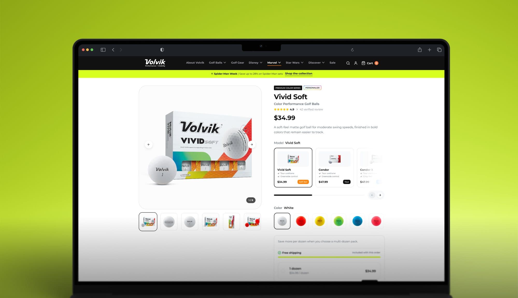
Models side by side,
not buried in a dropdown.
The model selector shows each ball as a card with its feel, control notes and price, so the comparison happens on the page instead of across three tabs. Colour swatches sit directly below, and the gallery follows the selection.
03Bundles & add-ons
Bigger packs and gift sets,
priced in context.
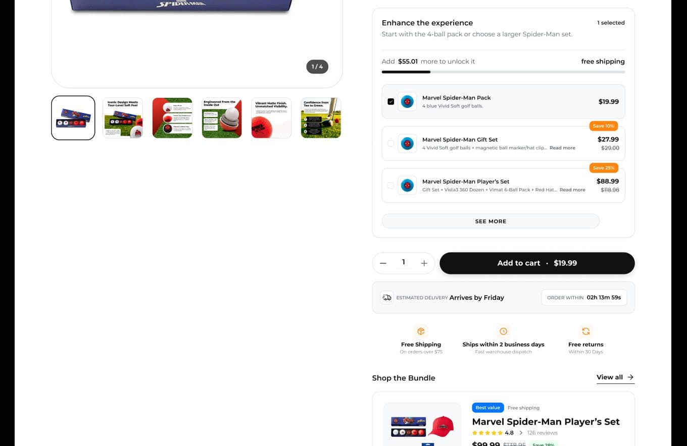
A multi-dozen saving and the free-shipping threshold are shown inside the configurator, and licensed packs offer the gift set and player’s set as add-ons with the saving stated. The upsell reads as a next step, not a pop-up.
04Collection
Filters that match
how golfers shop.
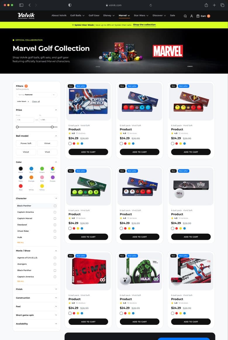
The Marvel collection page filters by ball model, colour, character, movie and feel, and the four-hero band sells the set when the grid does not. Volvik’s catalogue logic became the navigation.
Next: the mobile experience
05Mobile
The same decisions,
one thumb wide.
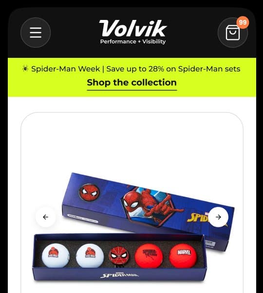
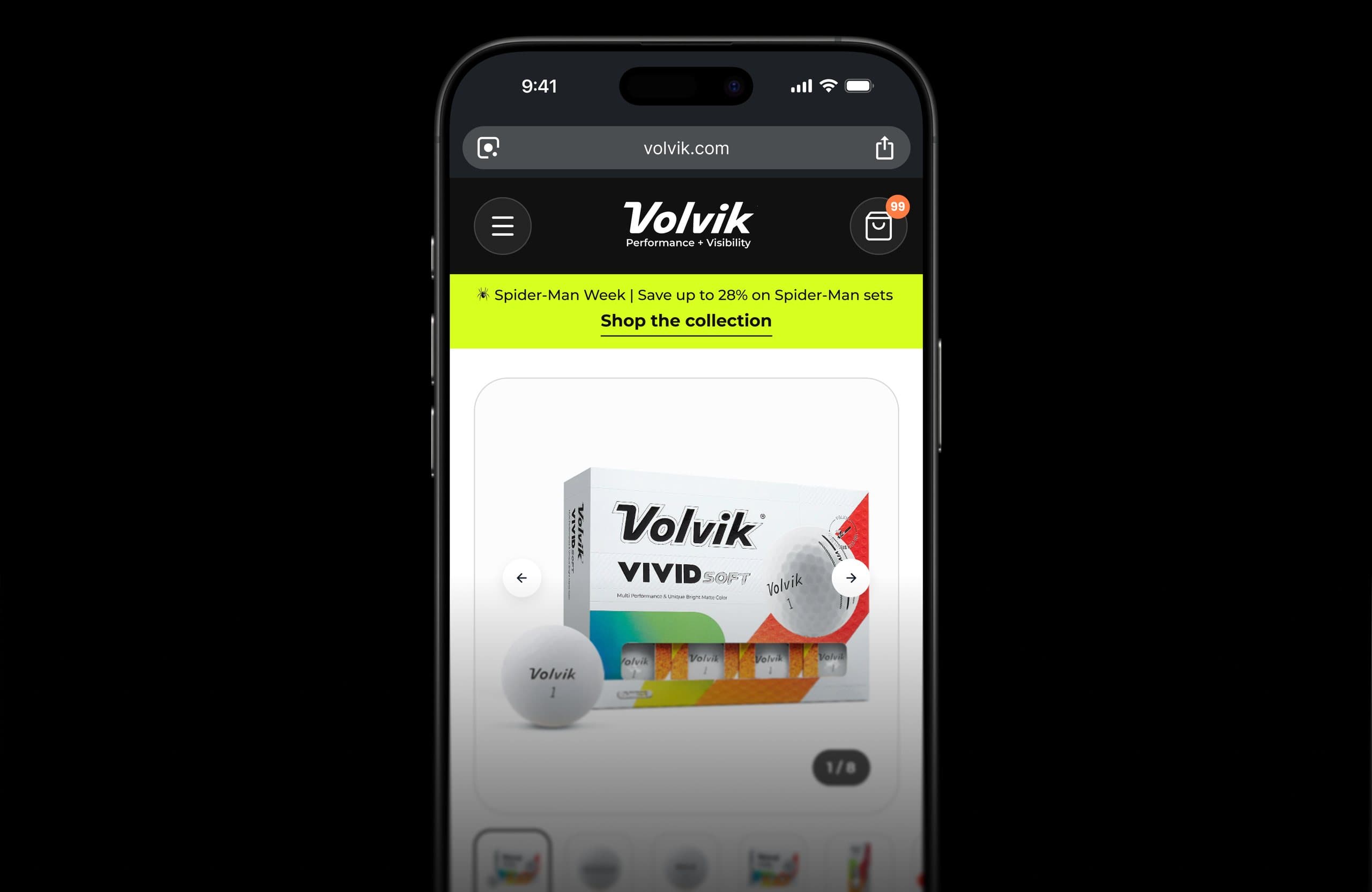
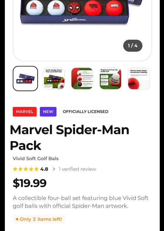
On the phone the gallery, model cards and colour swatches stack in the same order as desktop, and the bundle module keeps its savings visible before the add-to-cart bar.
Every option kept.
None in the way.
Licensed packs use the same page system: character selector, add-on set and bundle module, with the artwork doing the selling.
More work
More work.
Same level of thinking.
A broader range of eCommerce, SaaS and web projects. SwipeScroll through, open what is relevant.
eCommerce · CRO
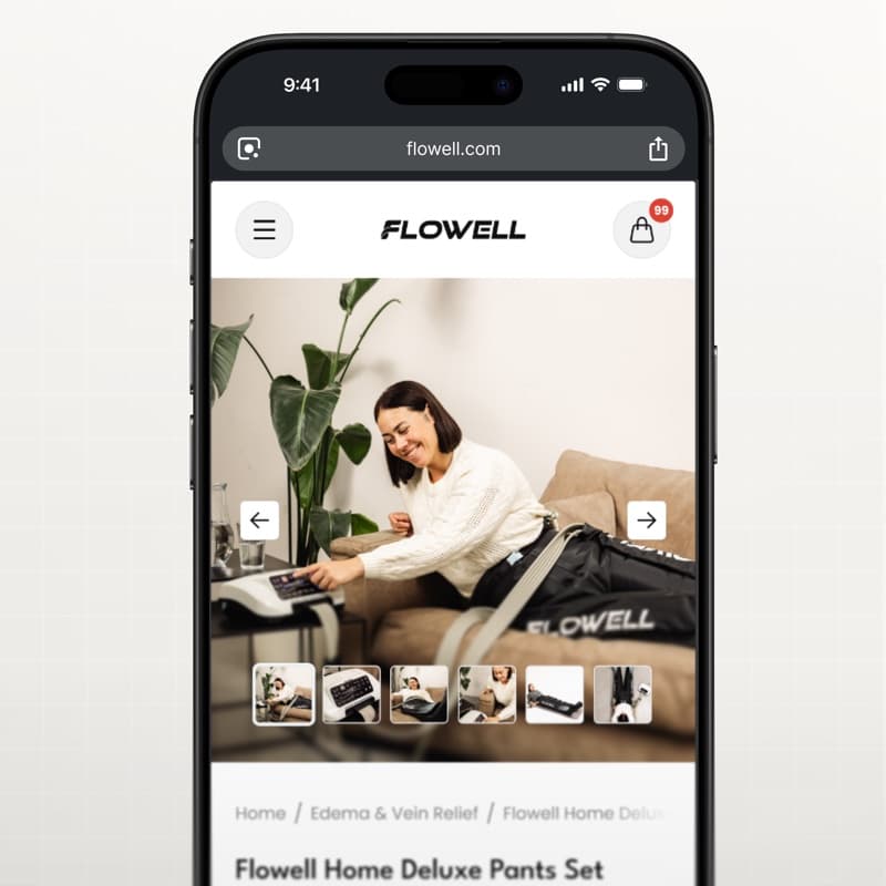
Flowell — eCommerce conversion optimization
Storefront and product pages redesigned around clearer product education and a more confident path to purchase.
View case study Flowell — eCommerce conversion optimization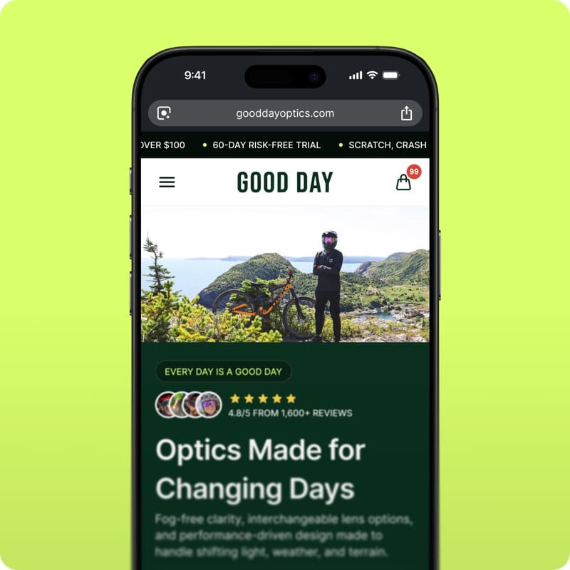
eCommerce · Shopify
GoodDay Optics — Shopify eCommerce redesign
Storefront redesign for an eyewear brand: homepage, collections and product pages built to convert.
View case study GoodDay Optics — Shopify eCommerce redesign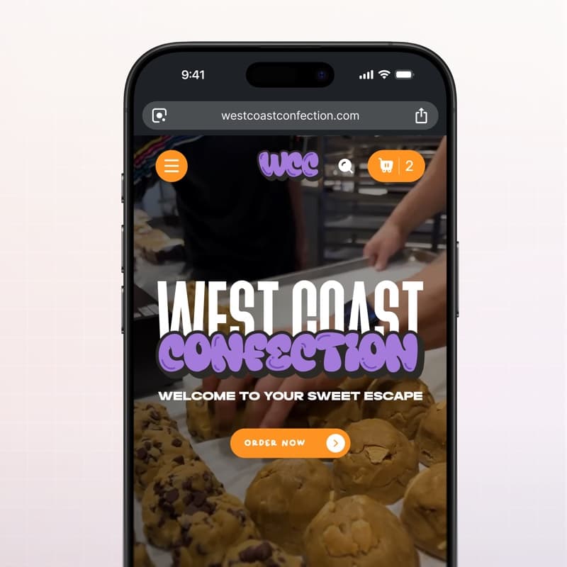
eCommerce · Web design
West Coast Confection — eCommerce website
Playful storefront for a cookie brand: menu, product pages and cart built for quick ordering.
View case study West Coast Confection — eCommerce website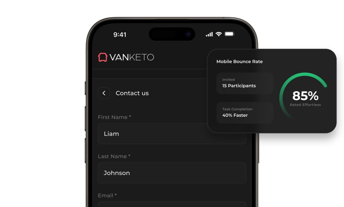
SaaS · Product UX
Vanketo — customer & employee portal
Portal UX/UI for order management: customers track their orders, staff process them, one interface for both.
View case study Vanketo — customer & employee portal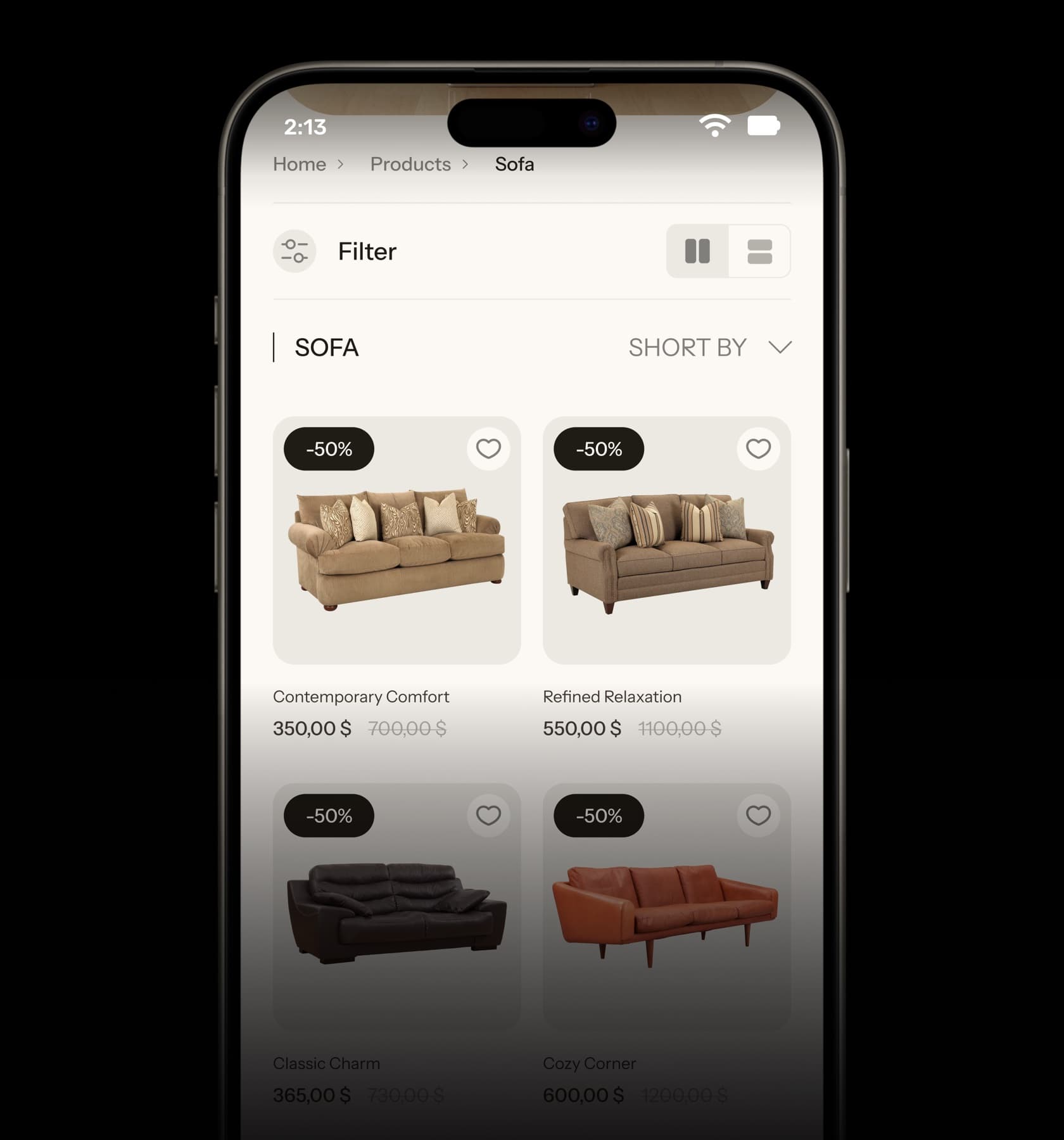
eCommerce · UX/UI
Collections — furniture eCommerce UX/UI
Home, collection and product pages for a furniture store, designed from the phone up.
View case study Collections — furniture eCommerce UX/UI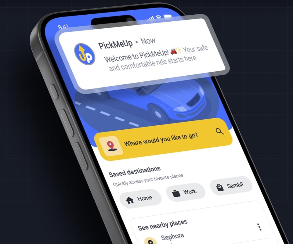
Mobile app · Product design
PickMeUp — ride-hailing app UX/UI
Mobility app case study: destination, car selection and ride flow designed for Venezuela.
View case study PickMeUp — ride-hailing app UX/UI


Have a project with
a similar problem?
Share the product, page or funnel you want to improve. You’ll get a straight answer on fit, scope and timing.
Independent studio — you work directly with Dylan Allynder.