Case study — West Coast Confection
Loud brand.
Fast checkout.
West Coast Confection bakes oversized cookies, blondies and brownies in San Diego. The site had to carry the brand’s playful voice and still get a hungry visitor from the menu to the cart in a few taps.

01Context
A personality that had
to survive the interface.
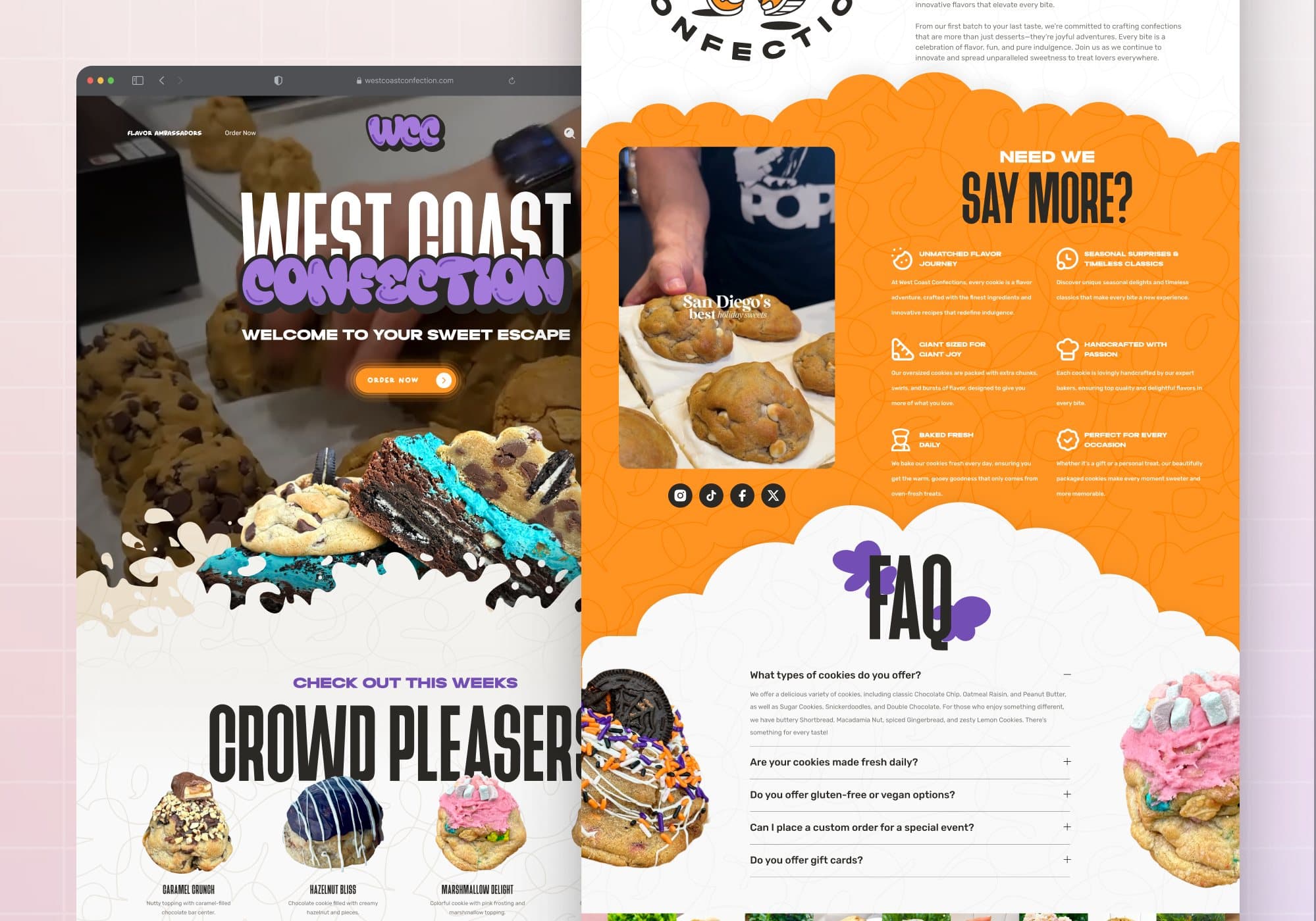
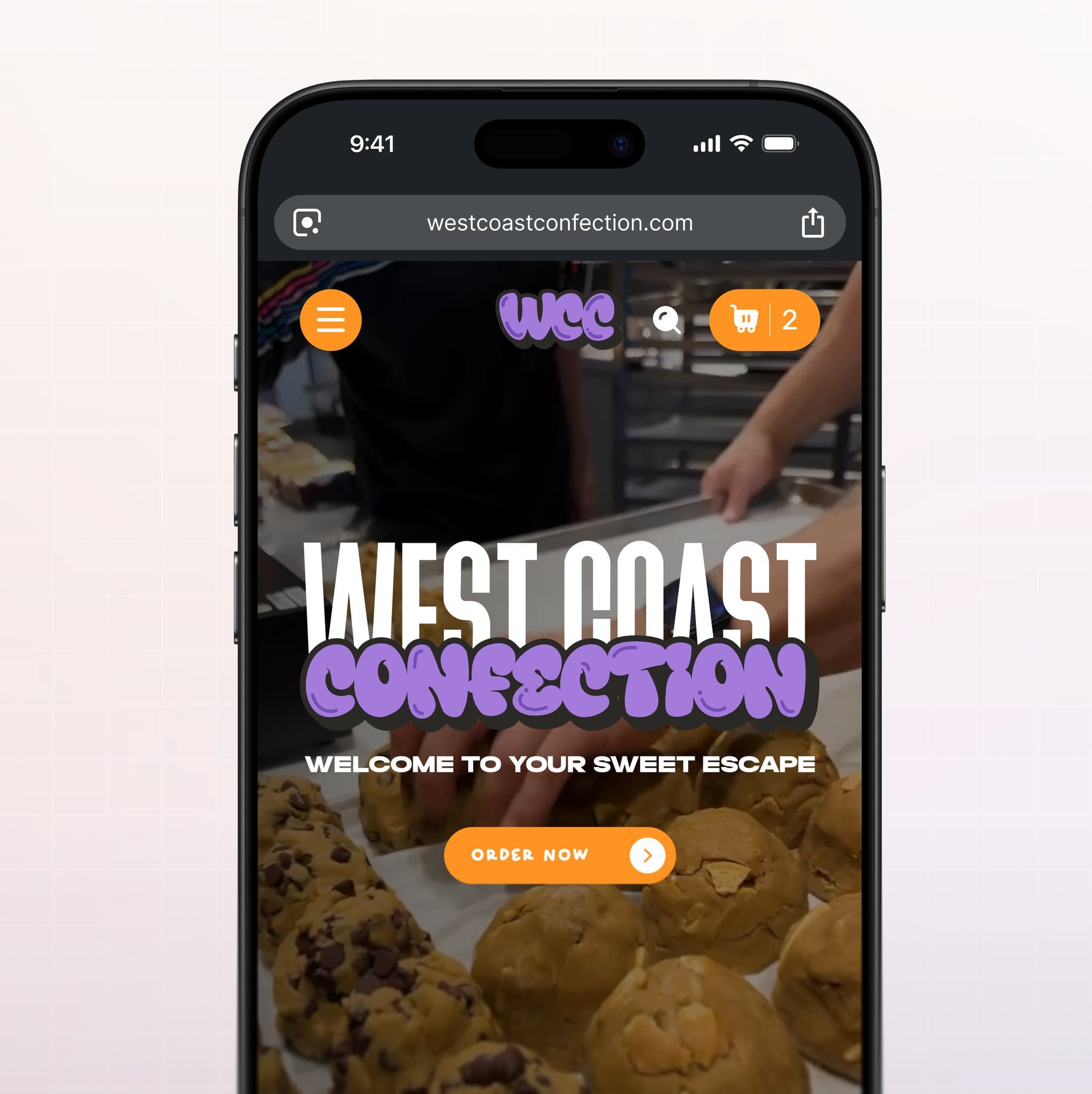
Purple, orange, graffiti type and video of the bakery are the brand. The risk was a storefront that looked fun and shopped badly. Structure came first (menu, product, cart) and the brand was then applied to every surface of that structure.
Scope: homepage, cookie collection page with filters, product page with pack quantities and a weekly-batch countdown, cart and checkout entry, all designed for desktop and mobile.
Order now
should take seconds.
02Discovery & product
Four categories,
then the whole menu.
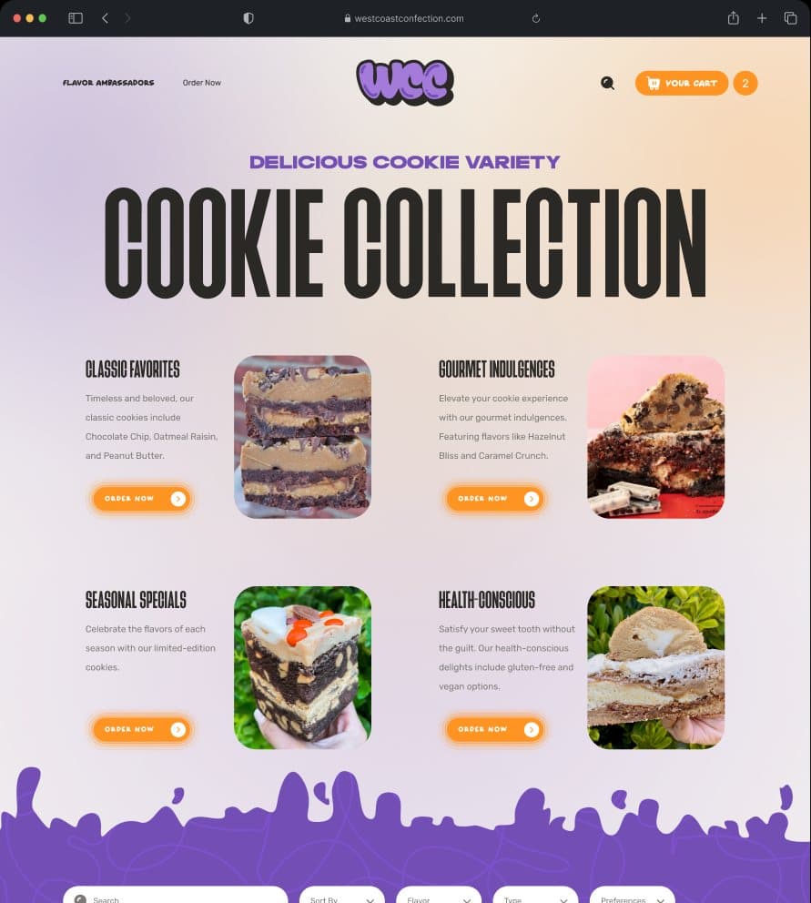
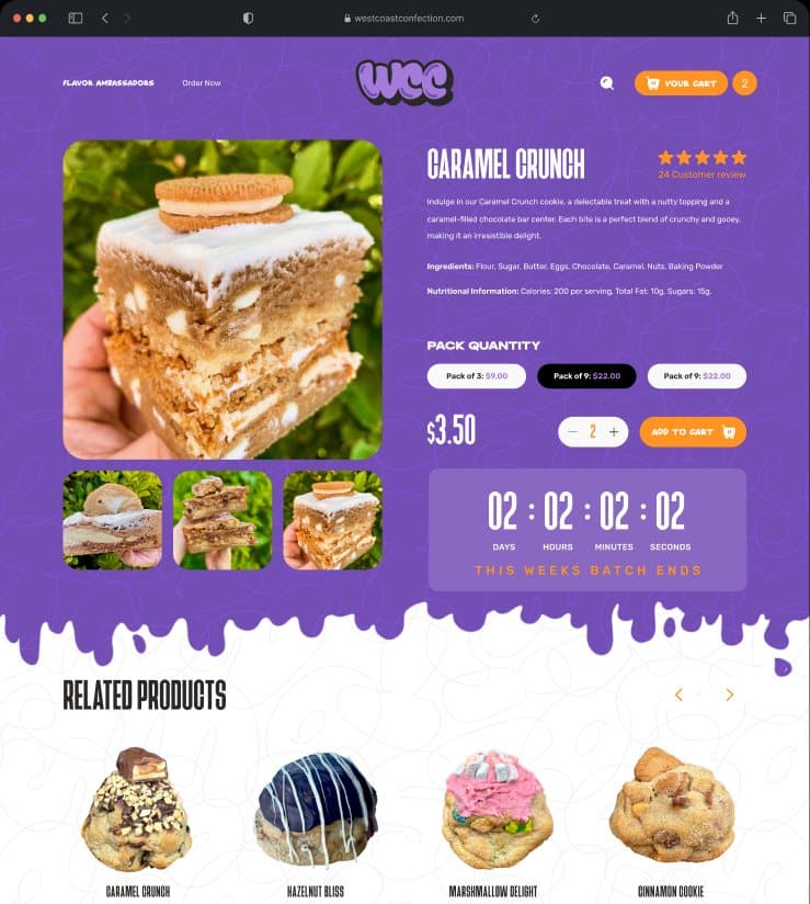
The collection page opens with Classic Favorites, Seasonal Specials, Gourmet Indulgences and Health-Conscious, each with its own order button, before the full grid with search, sort and flavour filters. The product page keeps the same energy: pack quantity (3, 6, 9), a countdown to the week’s batch and video reviews below the fold.
02Discovery
Four categories, then the whole menu.
The collection page opens with Classic Favorites, Seasonal Specials, Gourmet Indulgences and Health-Conscious, each with its own order button, before the full grid with search, sort and flavour filters.
03Product page
Pack size, batch countdown, video proof.
The product page keeps the brand energy: pack quantity (3, 6, 9), a countdown to the week’s batch, related products and video reviews below the fold.
03Cart
A cart that reads
like a receipt.
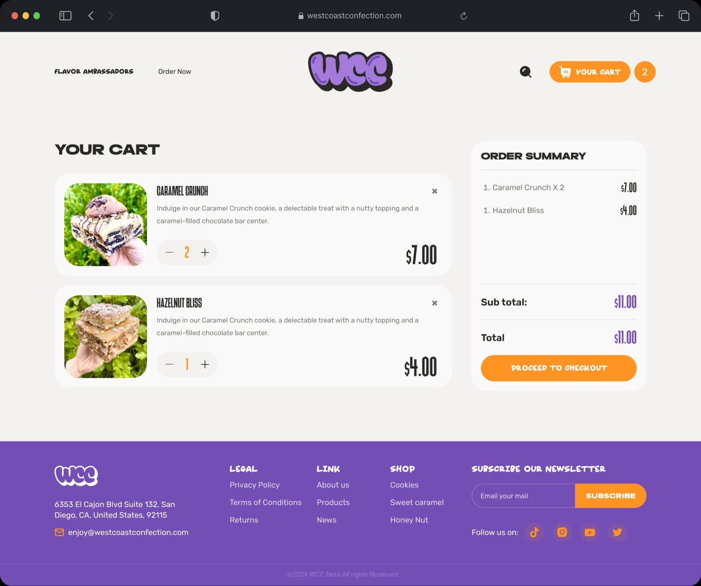
Line items with quantity steppers, an order summary and one orange button: the checkout entry is the calmest screen on the site, on purpose.
04Cart
A cart that reads like a receipt.
Line items with quantity steppers, an order summary and one orange button: the checkout entry is the calmest screen on the site, on purpose.
Next: the mobile experience
04Mobile
Built for a phone
held with one hand.
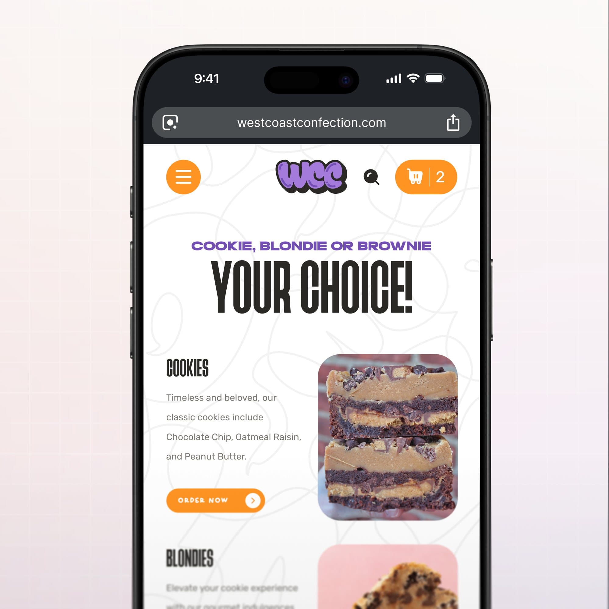
The mobile menu page puts the three product types (cookie, blondie, brownie) under a single headline with an order button each; the cart badge stays in the header throughout.
Playful on the surface.
Strict underneath.
More work
More work.
Same level of thinking.
A broader range of eCommerce, SaaS and web projects. SwipeScroll through, open what is relevant.
eCommerce · CRO
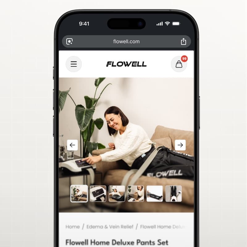
Flowell — eCommerce conversion optimization
Storefront and product pages redesigned around clearer product education and a more confident path to purchase.
View case study Flowell — eCommerce conversion optimization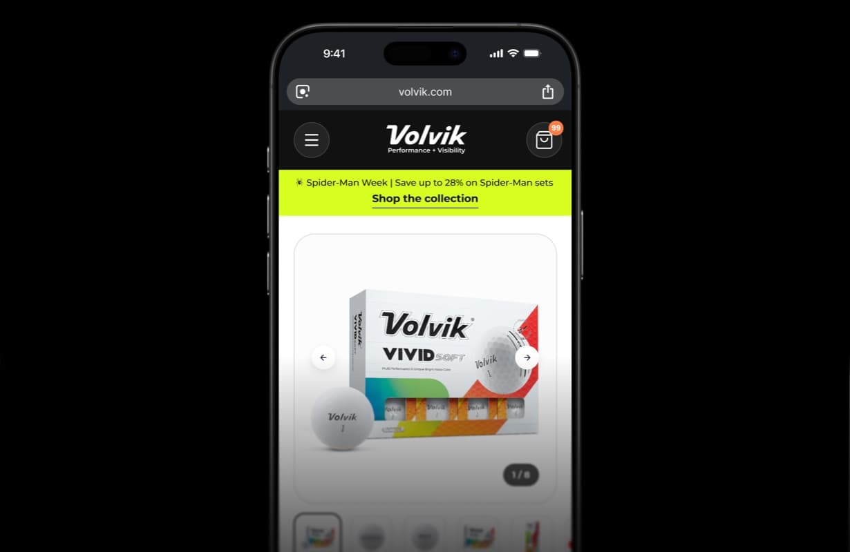
eCommerce · CRO
Volvik — eCommerce PDP redesign & CRO
Product detail page redesign and conversion optimization for a golf brand.
View case study Volvik — eCommerce PDP redesign & CRO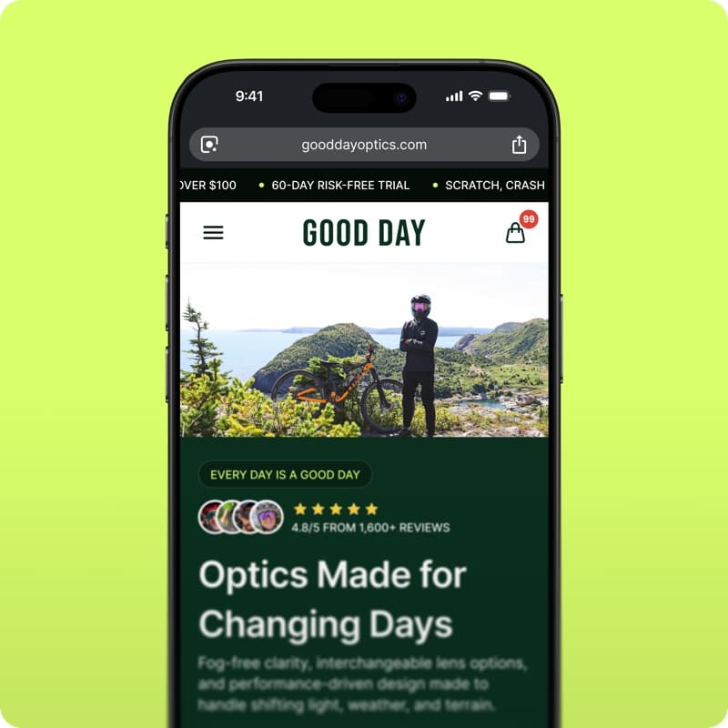
eCommerce · Shopify
GoodDay Optics — Shopify eCommerce redesign
Storefront redesign for an eyewear brand: homepage, collections and product pages built to convert.
View case study GoodDay Optics — Shopify eCommerce redesign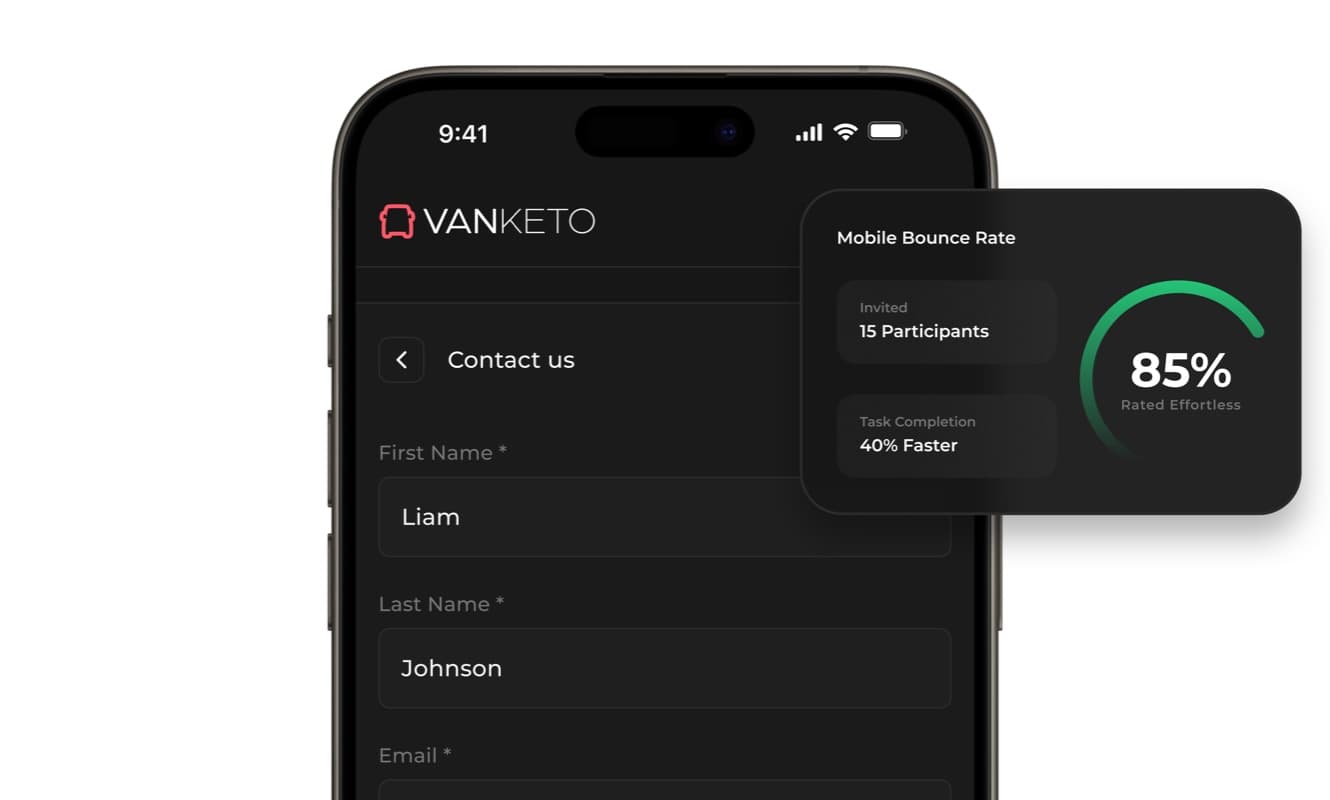
SaaS · Product UX
Vanketo — customer & employee portal
Portal UX/UI for order management: customers track their orders, staff process them, one interface for both.
View case study Vanketo — customer & employee portal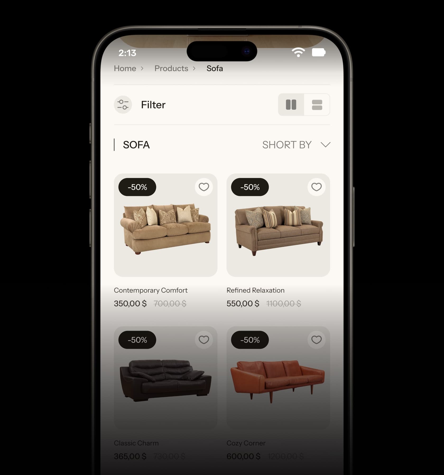
eCommerce · UX/UI
Collections — furniture eCommerce UX/UI
Home, collection and product pages for a furniture store, designed from the phone up.
View case study Collections — furniture eCommerce UX/UI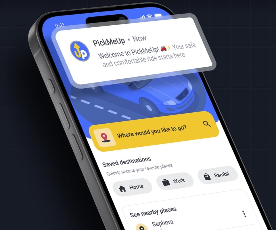
Mobile app · Product design
PickMeUp — ride-hailing app UX/UI
Mobility app case study: destination, car selection and ride flow designed for Venezuela.
View case study PickMeUp — ride-hailing app UX/UI


Have a project with
a similar problem?
Share the product, page or funnel you want to improve. You’ll get a straight answer on fit, scope and timing.
Independent studio — you work directly with Dylan Allynder.