Case study — Flowell
A medical device,
made easy to buy.
Flowell sells medical-grade compression therapy for home recovery. The storefront had to explain the system, help people choose between relief and recovery, and make a considered purchase feel simple.

01Context
Simple to use.
Harder to explain.
Flowell builds pneumatic compression systems that bring clinic-grade leg therapy home: one click, a full-leg massage, relief in a single session. Engineered in Germany, sold in the U.S., built around a founder’s family story.
A first-time visitor arrives with the questions a clinic would normally answer. Is this for pain relief or sports recovery? Which set, which fit, which add-ons? Is a $1,299 system worth it?
The storefront had to carry that conversation on its own, and turn it into orders.

Show the value before
asking for the sale.
02The idea
Two paths. One decision.
Every visitor is either in pain or in training. The homepage splits the range into Pain Relief and Sports Recovery, and a product finder matches goals to a system, a size and the right add-ons. Nobody has to understand the whole catalogue to find their product.

03The experience
Make the configuration obvious.
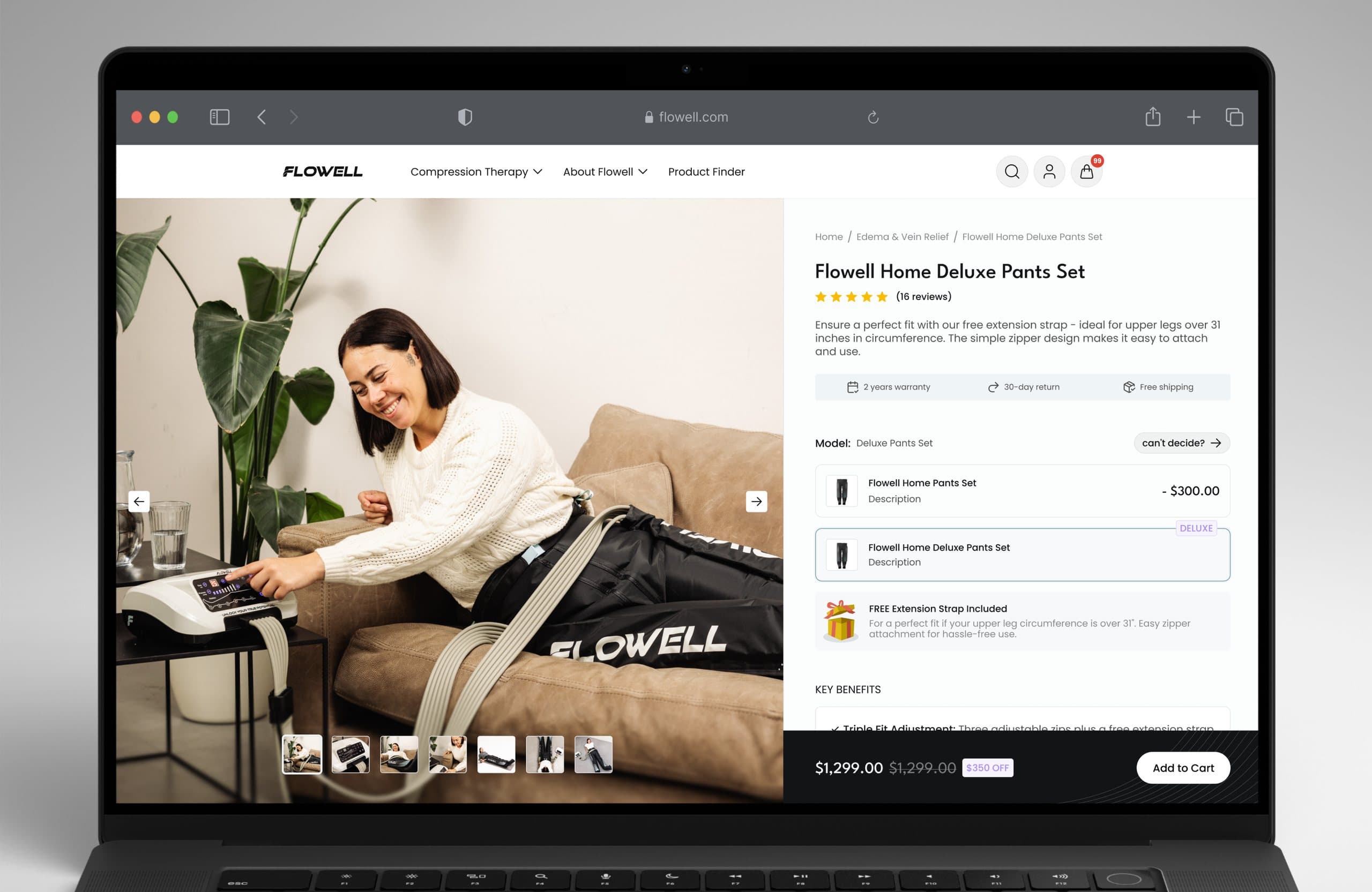
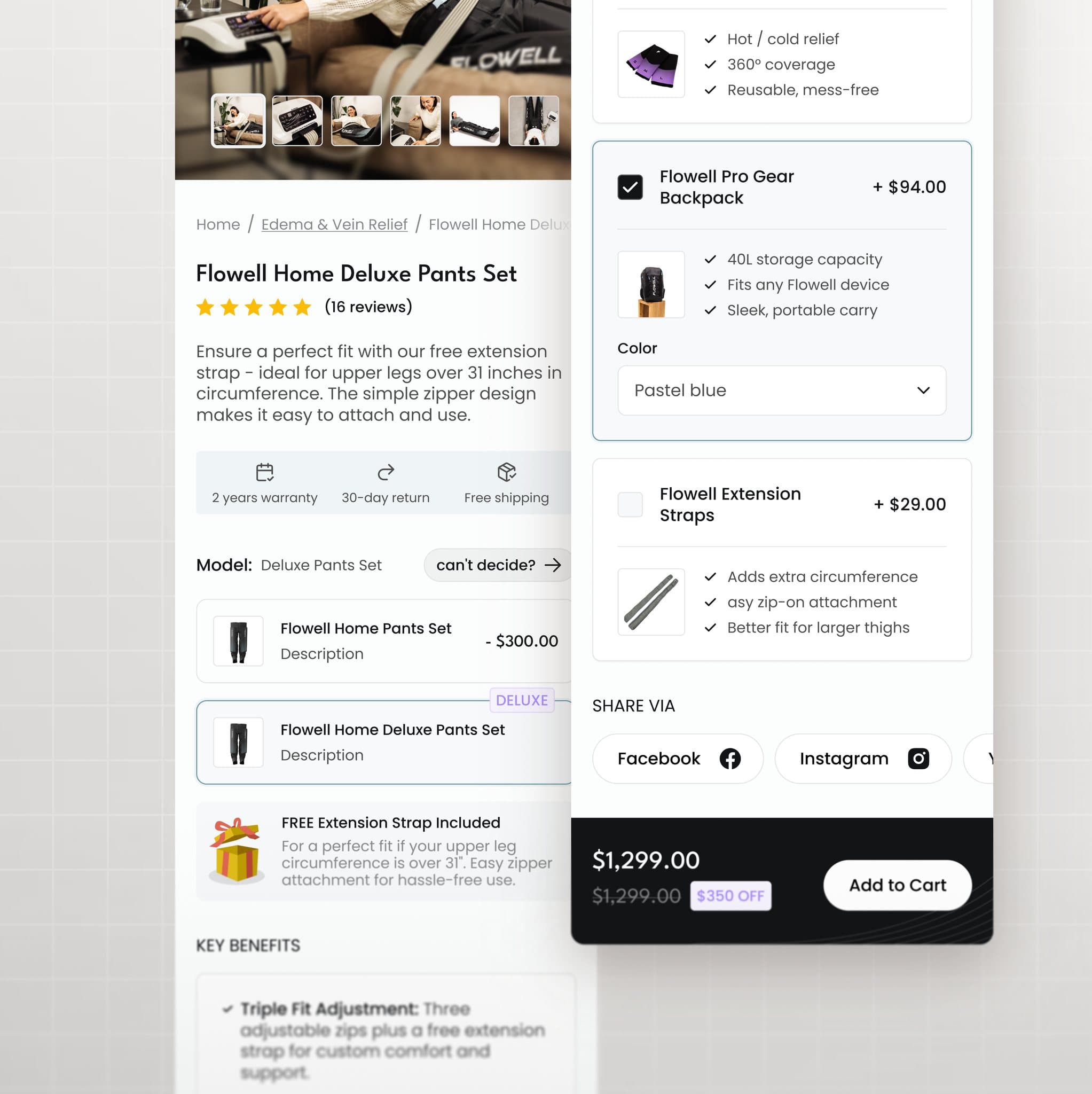
The product page turns a medical purchase into three visible choices: the set, the fit, the add-ons. Model and price difference sit side by side, the free extension strap is called out where fit is decided, and the key benefits read as a checklist instead of a paragraph.
04The details
Add-ons sell themselves
when they’re explained.
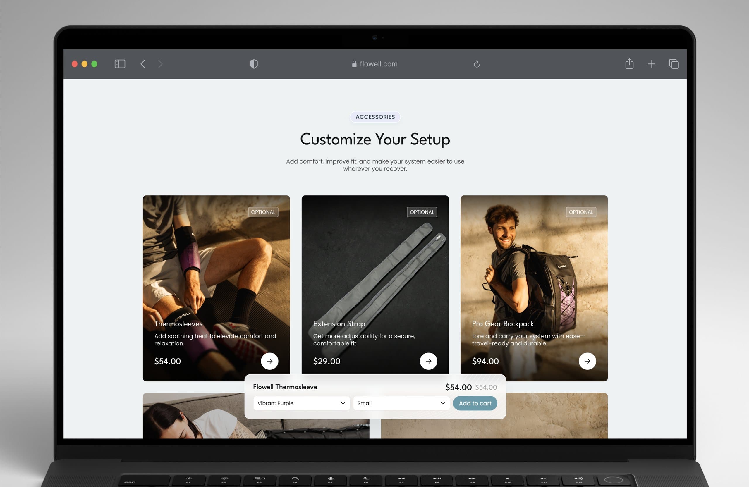
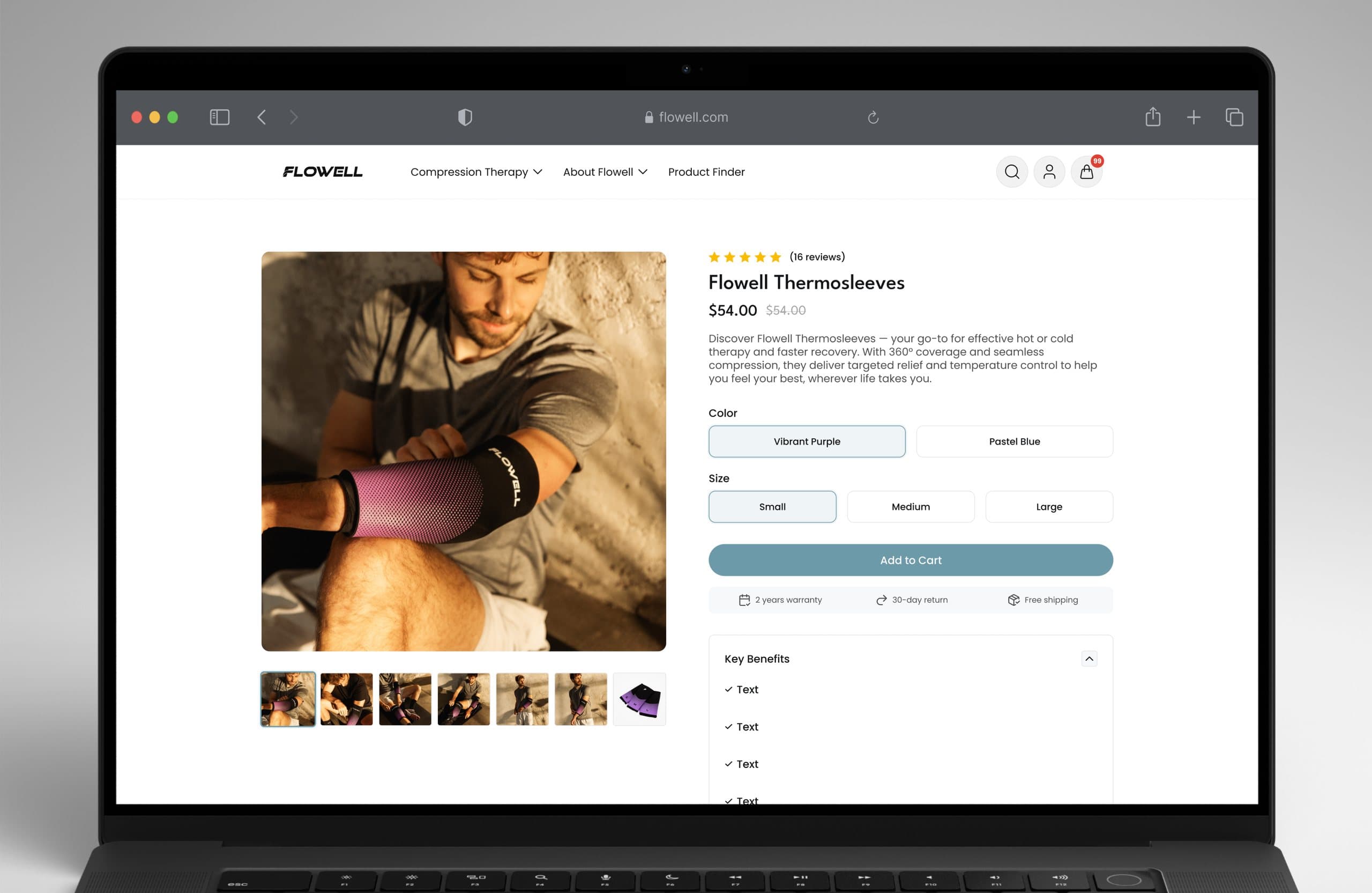
Thermosleeves and the gear backpack appear where they make sense: as optional cards on the product page and as a dedicated “Customize your setup” section, each with its own benefits and its own price.
Next: the mobile experience
05Mobile
Built for the screen
people actually shop on.
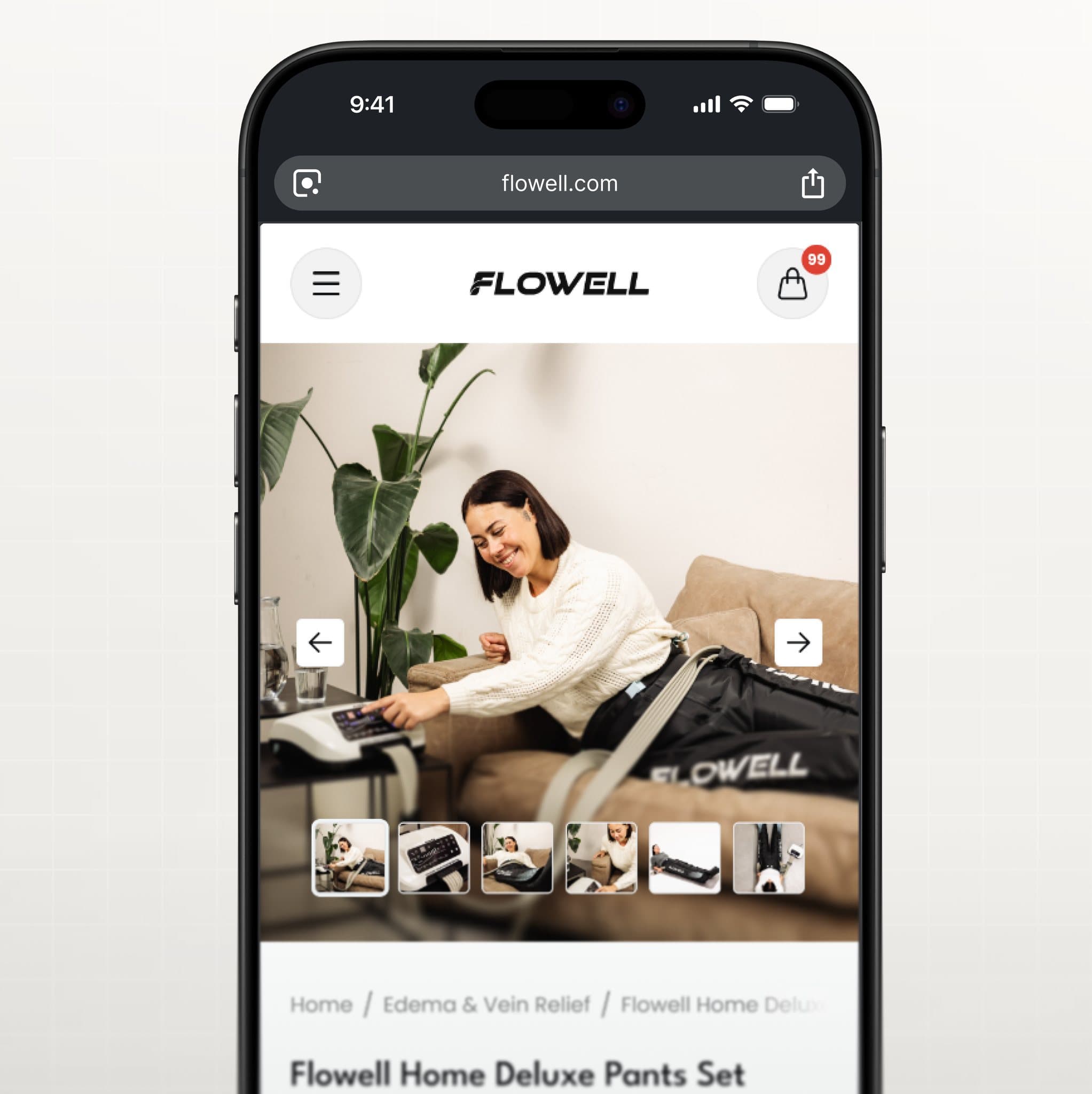
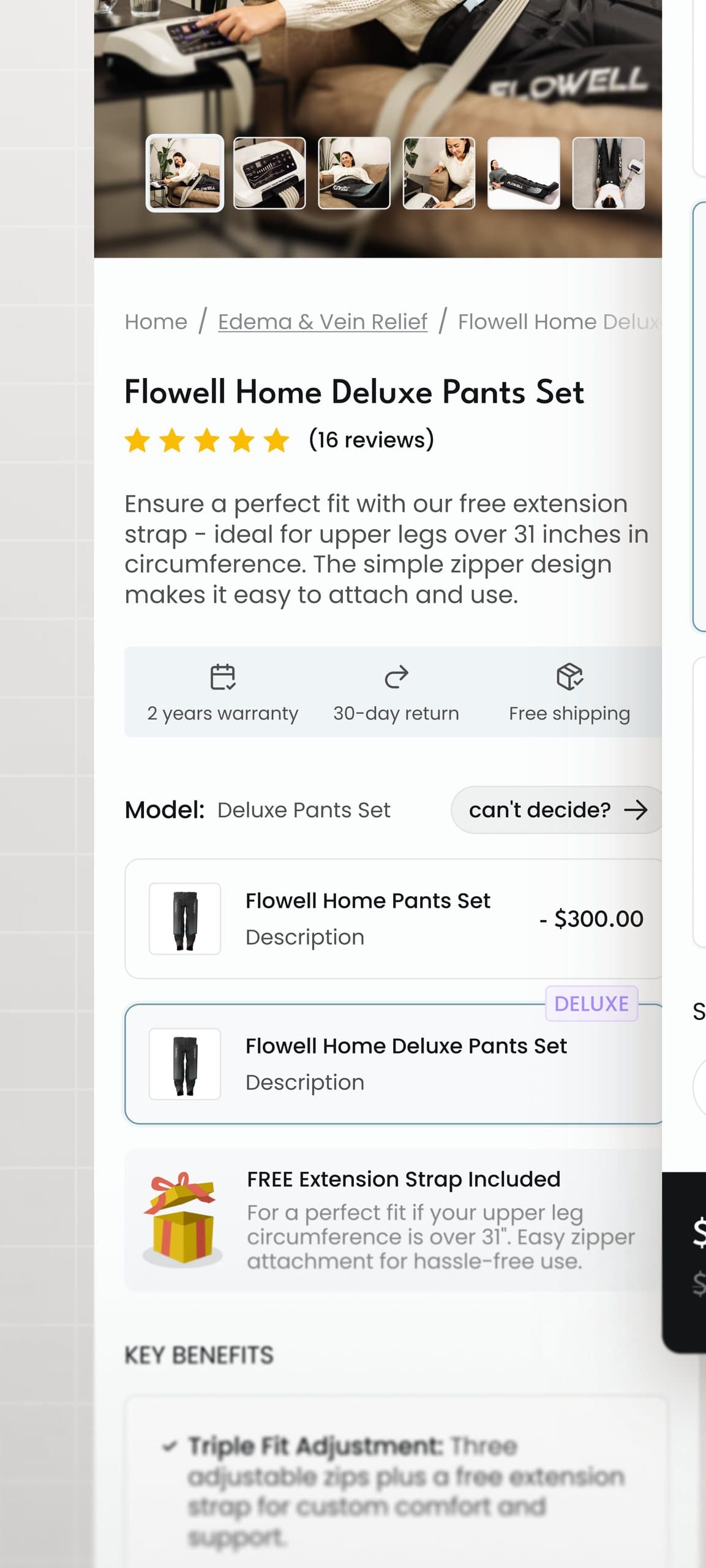
On the phone the gallery leads, price and model selection stay within reach of one thumb, and add-ons collapse into cards you can open or skip. Nothing from the desktop decision is lost; it is just stacked in the order people scroll.
06Trust
Proof where
the doubt happens.
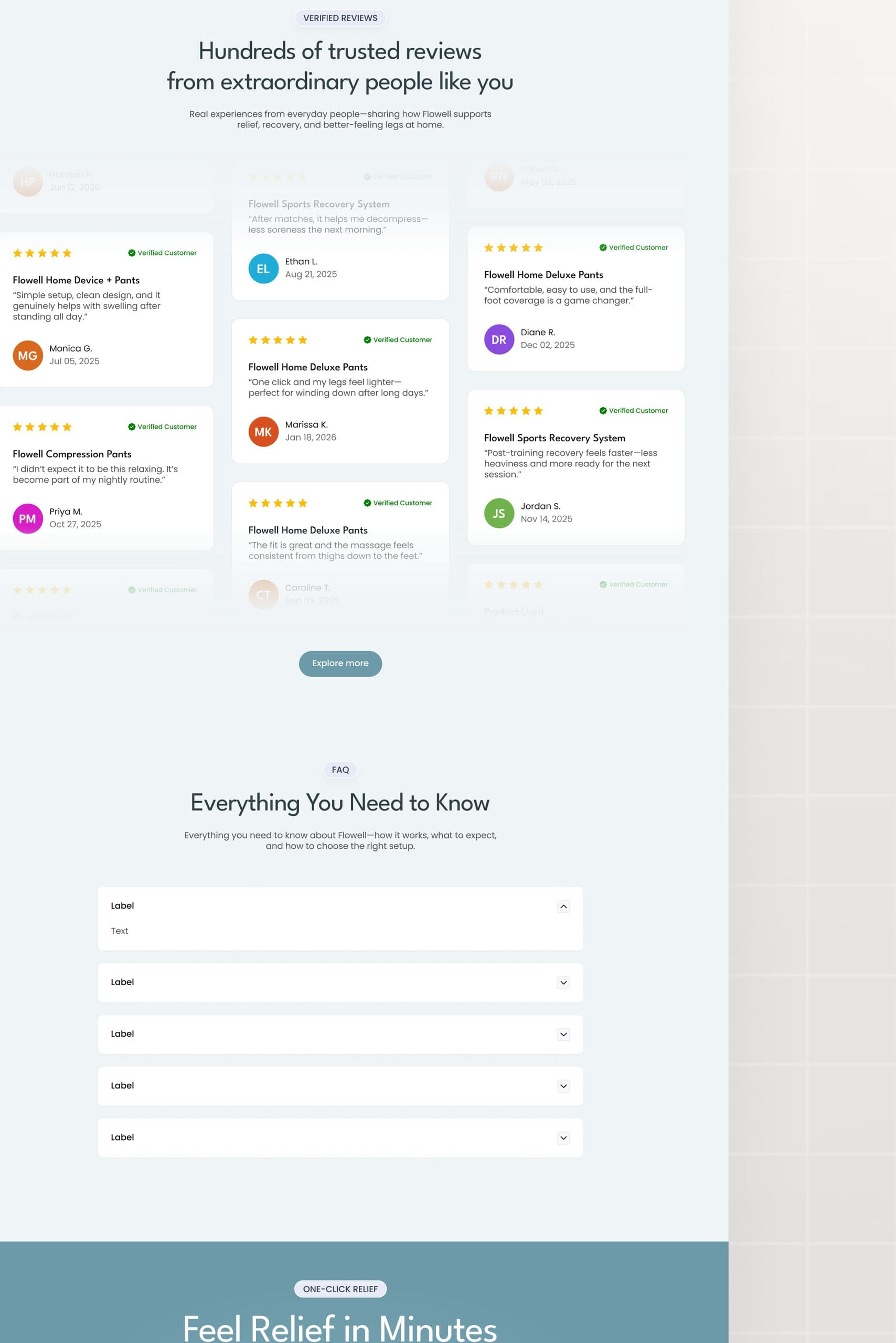
FDA approval, German engineering, free returns and HSA/FSA eligibility sit directly under the hero. Verified reviews, science-backed benefits and an FAQ answer the questions that stall a high-ticket purchase, before anyone has to ask them.
07Impact
Measured after launch.
Storefront performance after the redesign, across the four numbers that matter for an eCommerce business.
Fewer open questions.
More orders.
Every product page follows the same system: gallery, options, benefits, add-ons.
More work
More work.
Same level of thinking.
A broader range of eCommerce, SaaS and web projects. SwipeScroll through, open what is relevant.
eCommerce · CRO
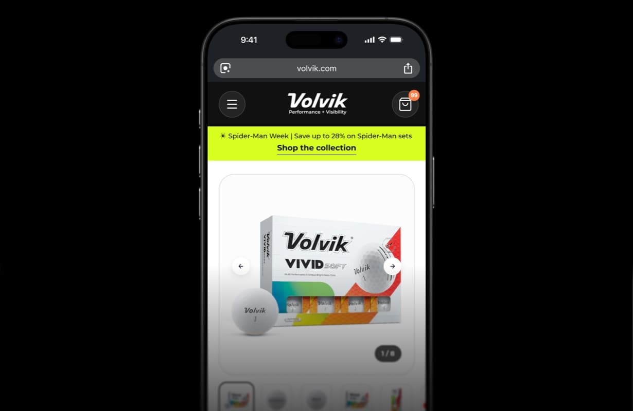
Volvik — eCommerce PDP redesign & CRO
Product detail page redesign and conversion optimization for a golf brand.
View case study Volvik — eCommerce PDP redesign & CRO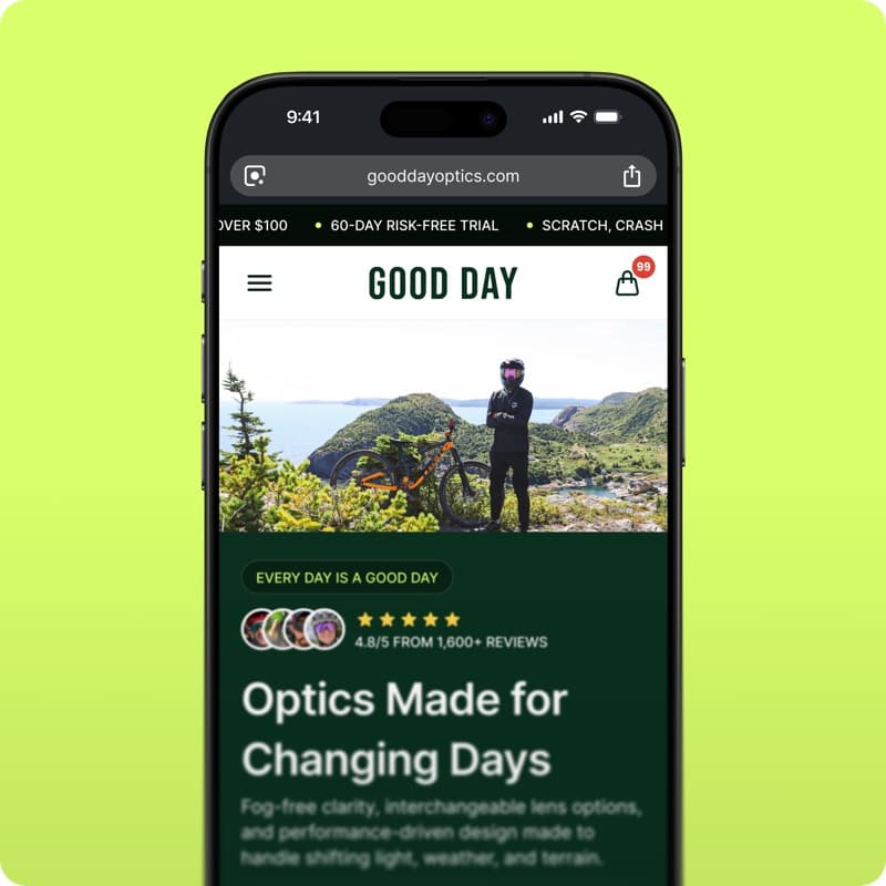
eCommerce · Shopify
GoodDay Optics — Shopify eCommerce redesign
Storefront redesign for an eyewear brand: homepage, collections and product pages built to convert.
View case study GoodDay Optics — Shopify eCommerce redesign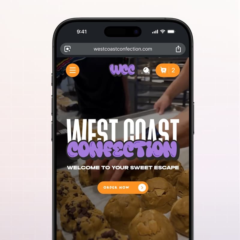
eCommerce · Web design
West Coast Confection — eCommerce website
Playful storefront for a cookie brand: menu, product pages and cart built for quick ordering.
View case study West Coast Confection — eCommerce website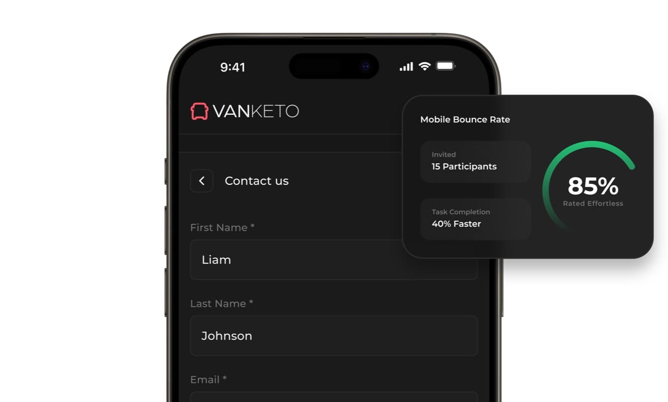
SaaS · Product UX
Vanketo — customer & employee portal
Portal UX/UI for order management: customers track their orders, staff process them, one interface for both.
View case study Vanketo — customer & employee portal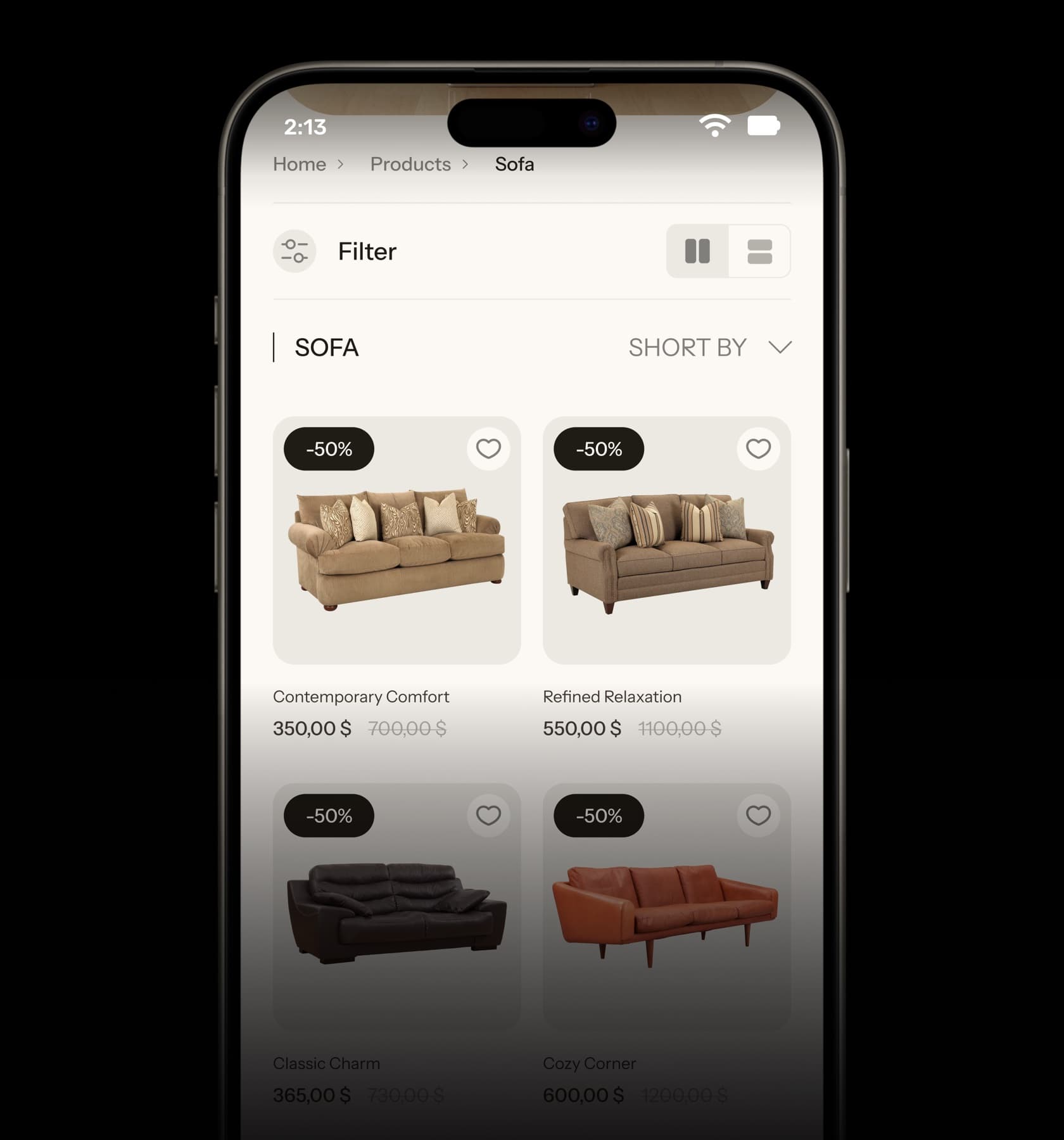
eCommerce · UX/UI
Collections — furniture eCommerce UX/UI
Home, collection and product pages for a furniture store, designed from the phone up.
View case study Collections — furniture eCommerce UX/UI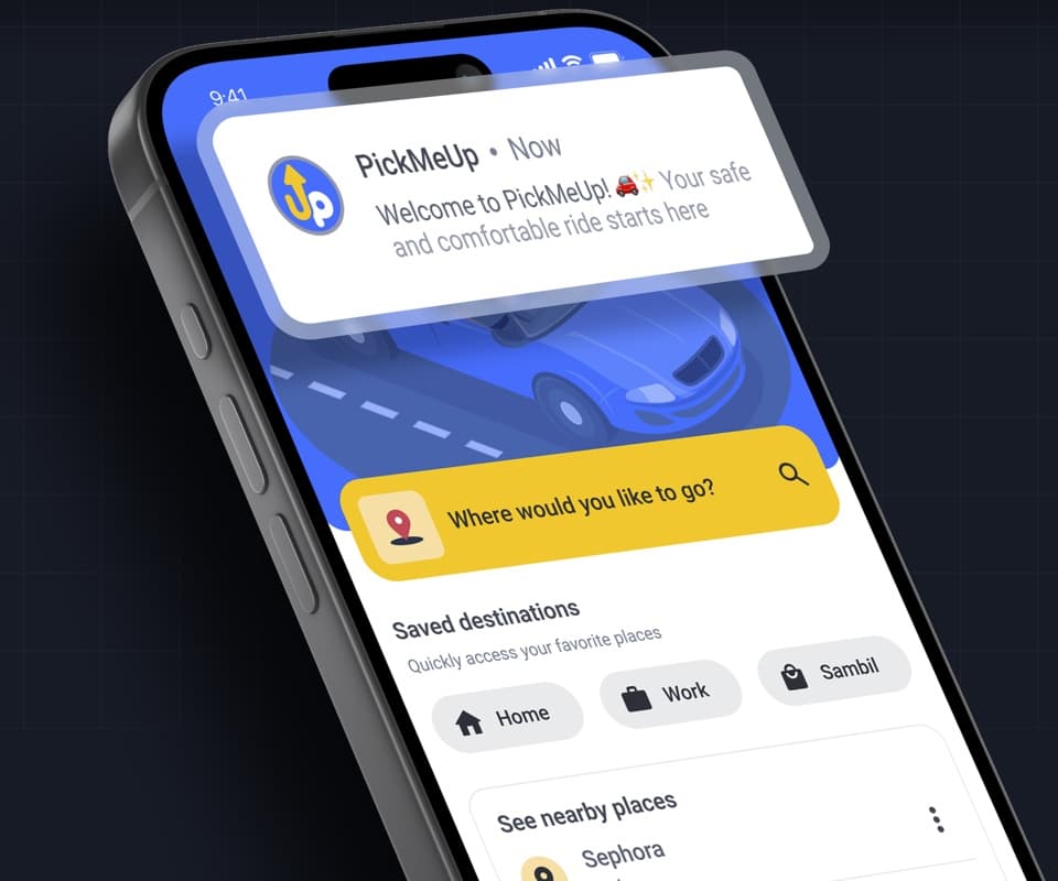
Mobile app · Product design
PickMeUp — ride-hailing app UX/UI
Mobility app case study: destination, car selection and ride flow designed for Venezuela.
View case study PickMeUp — ride-hailing app UX/UI


Have a project with
a similar problem?
Share the product, page or funnel you want to improve. You’ll get a straight answer on fit, scope and timing.
Independent studio — you work directly with Dylan Allynder.