Case study — GoodDay Optics
Sell the lens,
not just the look.
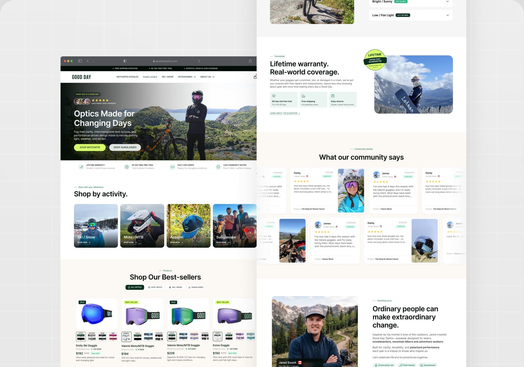
GoodDay Optics makes goggles and sunglasses for skiing, riding and everyday light. The Shopify storefront had to explain lens technology to first-time buyers while keeping the activity-first browsing that returning customers use.
01Context
Two kinds of buyers,
one homepage.
Riders know which goggle they want; newcomers need to understand why lens tint matters. The redesign gives both a path from the first screen: shop by activity for the first group, a tech guide and guarantee for the second.
The project covered the full storefront: homepage structure, product discovery, product cards with lens swatches, community proof and the support content that removes risk from a $200 purchase.
It is published on Upwork as “Shopify eCommerce Redesign | UX/UI & CRO”.

Explain the lens.
Earn the sale.
02Product discovery
Activity first,
then the catalogue.
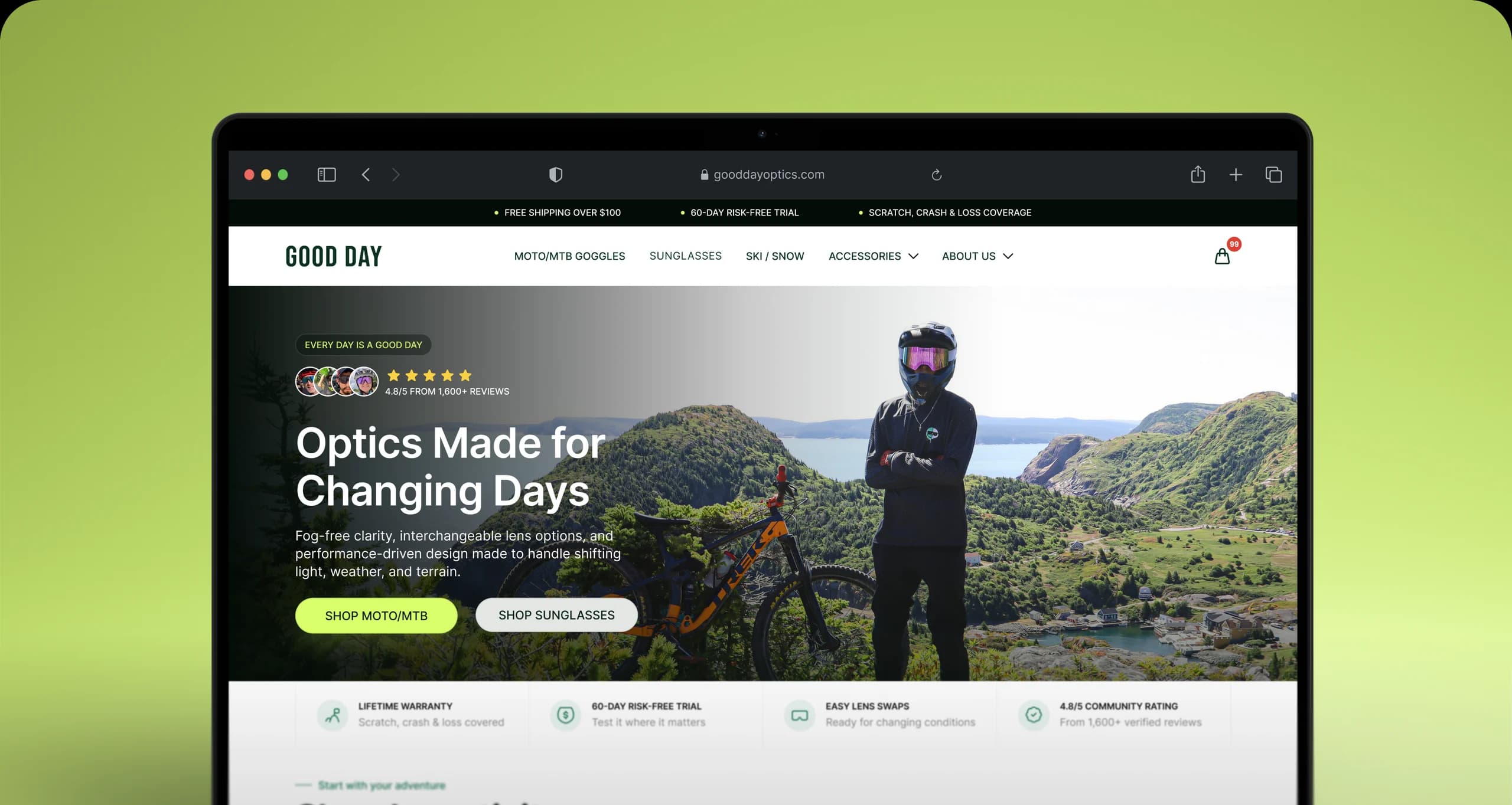
Shop-by-activity tiles (Ski / Snow, Moto / MTB, Apparel, Sunglasses) sit directly under the hero, followed by best-sellers with every lens variant shown as a swatch on the card. Buyers filter by how they ride before they compare specs.
03Education
Match the lens
to the mountain.
A tech guide turns VLT percentages into plain conditions: changing light, bright sun, flat light. Each condition recommends specific lenses, so the technical spec becomes a buying guide instead of a footnote.

04Trust
Guarantee, reviews,
founder.
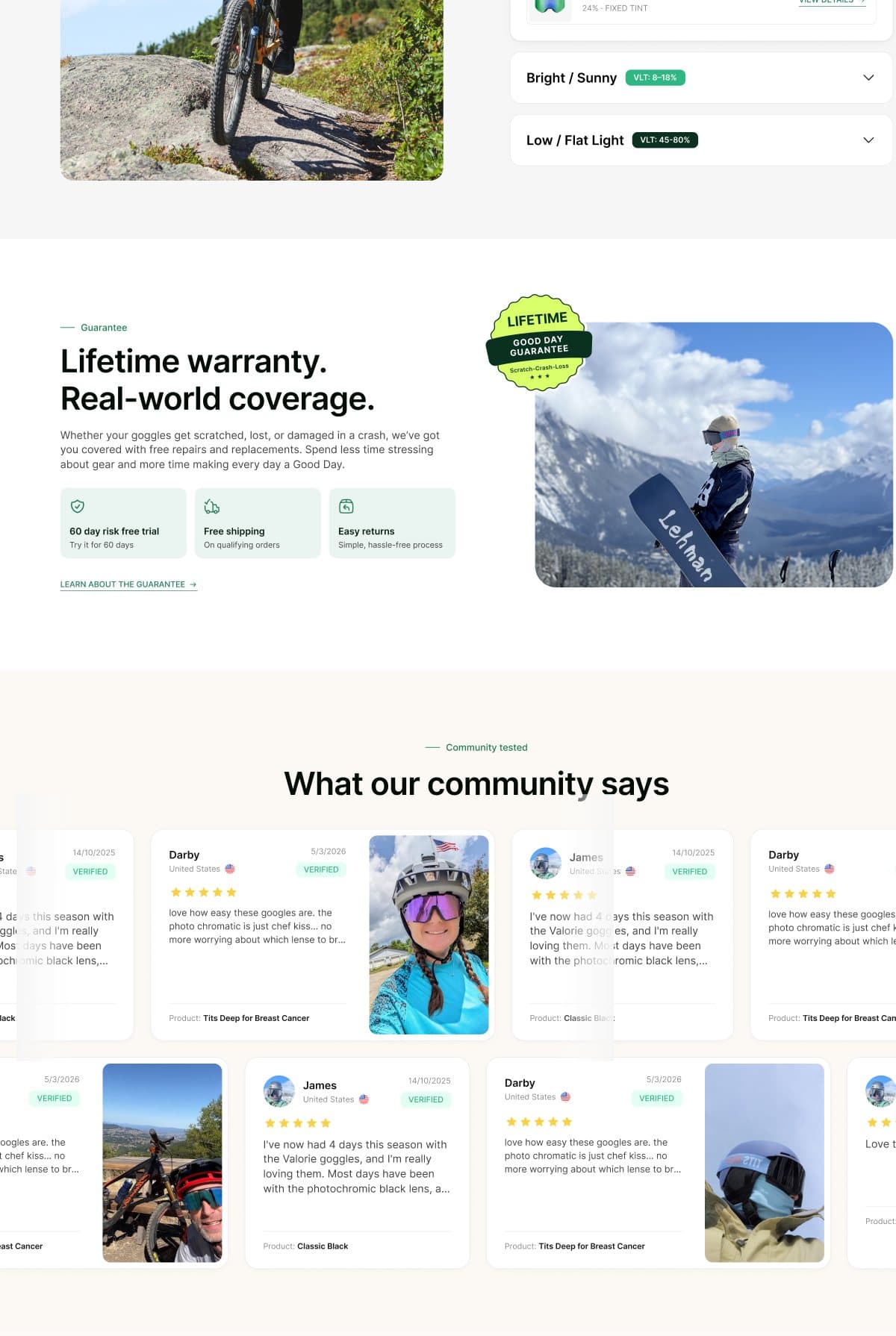
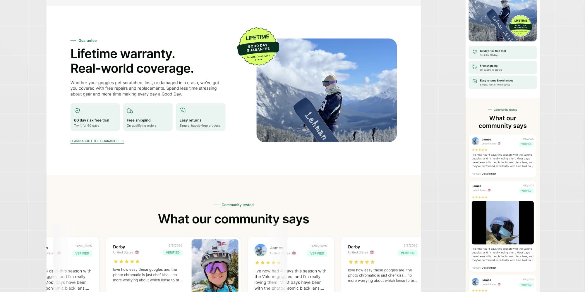
Lifetime warranty, a 60-day risk-free trial and verified community reviews with rider photos sit before the founder story. Risk is removed in the order a hesitant buyer asks about it.
Next: the mobile experience
05Mobile
The guide fits
in a pocket.
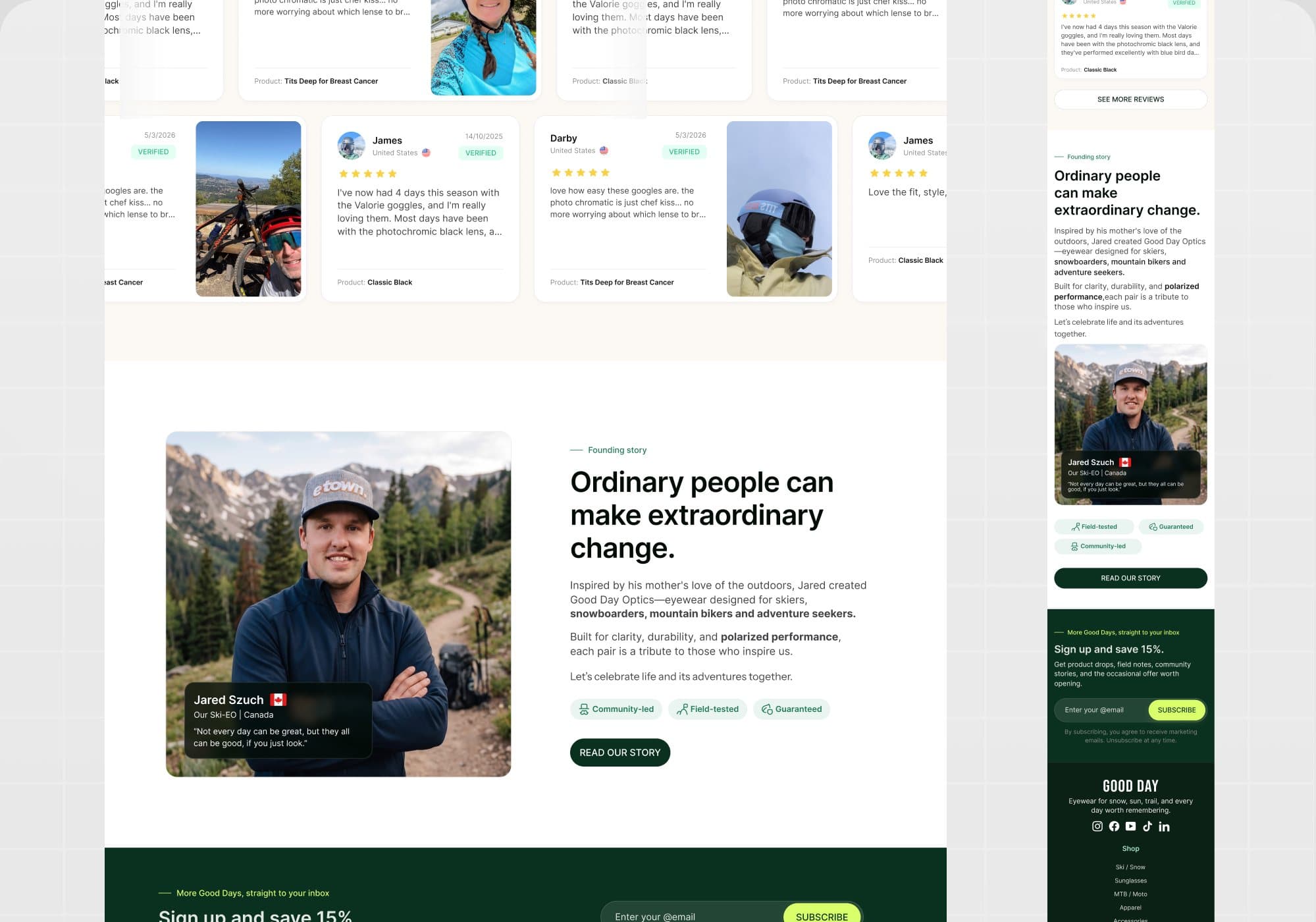
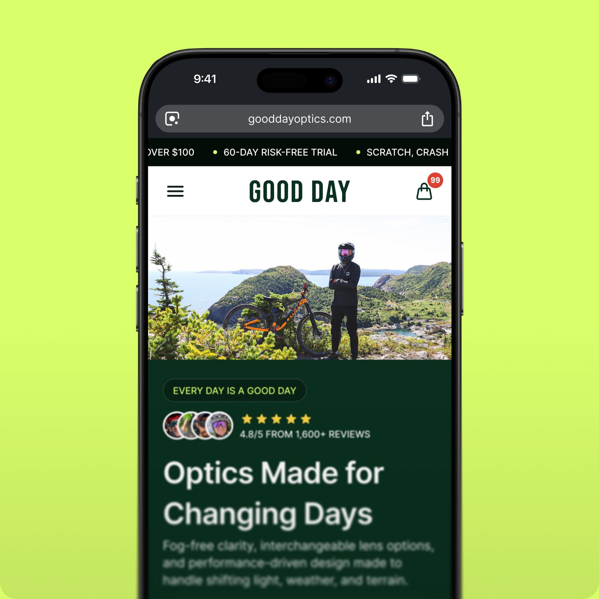
On the phone the tech guide collapses into accordion conditions and the reviews keep their photos, so the education and the proof survive the narrow screen.
Clear vision
sells itself.
The storefront as shipped: desktop and mobile share one structure from the hero to the founder story.
More work
More work.
Same level of thinking.
A broader range of eCommerce, SaaS and web projects. SwipeScroll through, open what is relevant.
eCommerce · CRO
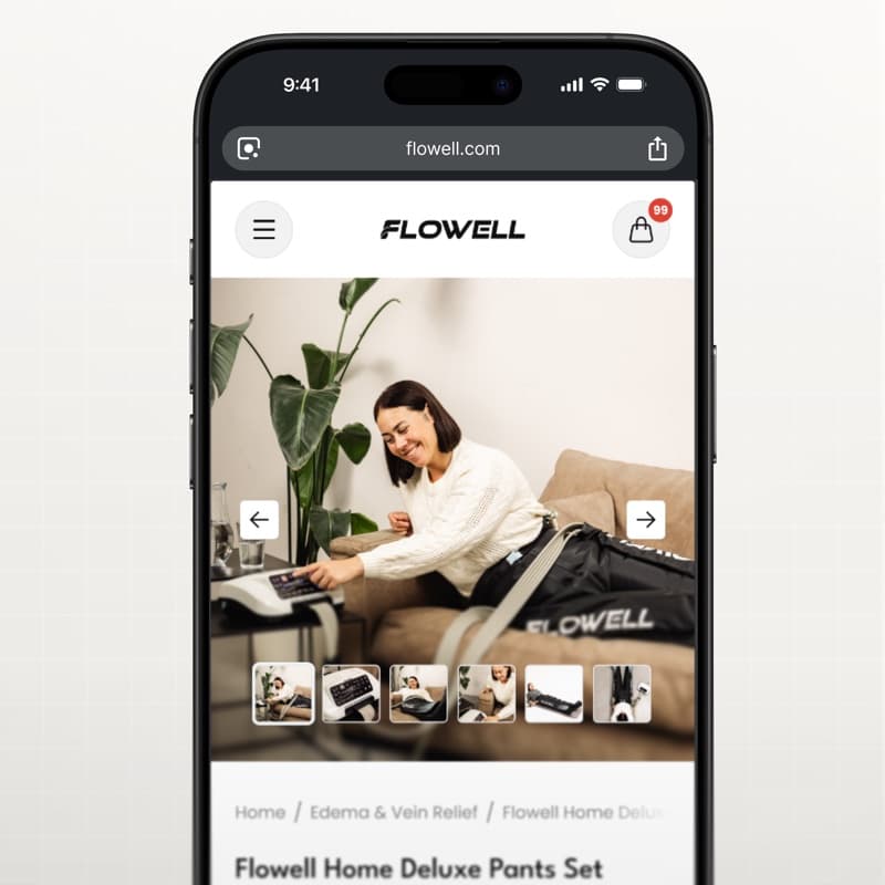
Flowell — eCommerce conversion optimization
Storefront and product pages redesigned around clearer product education and a more confident path to purchase.
View case study Flowell — eCommerce conversion optimization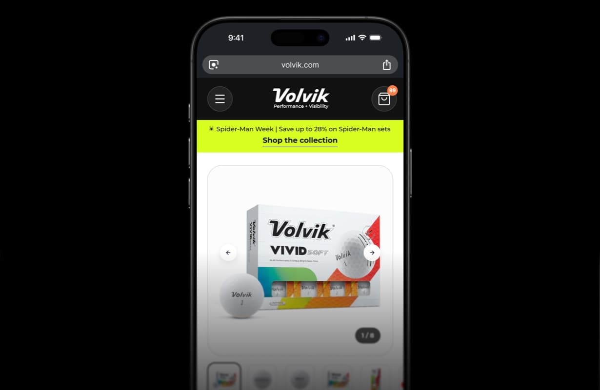
eCommerce · CRO
Volvik — eCommerce PDP redesign & CRO
Product detail page redesign and conversion optimization for a golf brand.
View case study Volvik — eCommerce PDP redesign & CRO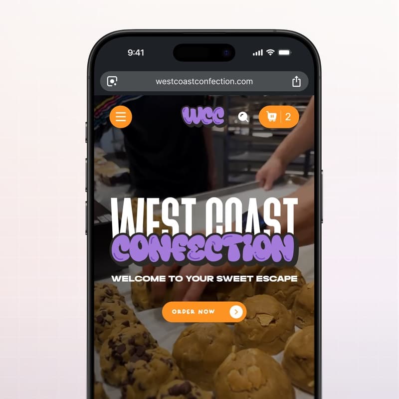
eCommerce · Web design
West Coast Confection — eCommerce website
Playful storefront for a cookie brand: menu, product pages and cart built for quick ordering.
View case study West Coast Confection — eCommerce website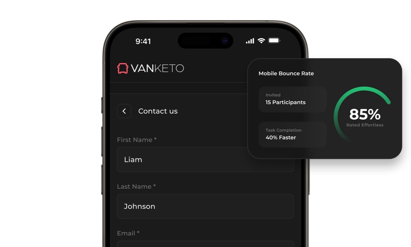
SaaS · Product UX
Vanketo — customer & employee portal
Portal UX/UI for order management: customers track their orders, staff process them, one interface for both.
View case study Vanketo — customer & employee portal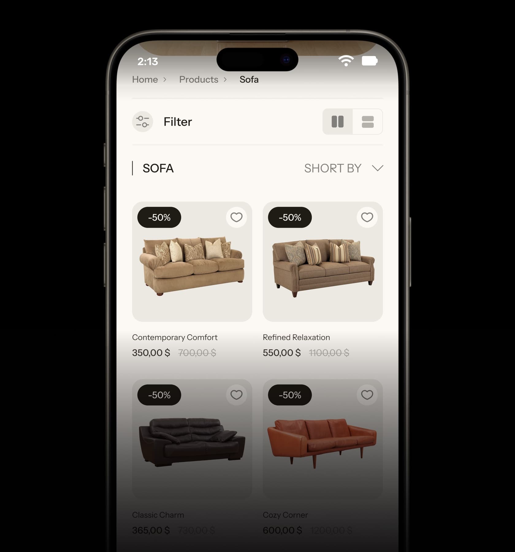
eCommerce · UX/UI
Collections — furniture eCommerce UX/UI
Home, collection and product pages for a furniture store, designed from the phone up.
View case study Collections — furniture eCommerce UX/UI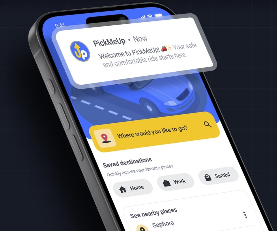
Mobile app · Product design
PickMeUp — ride-hailing app UX/UI
Mobility app case study: destination, car selection and ride flow designed for Venezuela.
View case study PickMeUp — ride-hailing app UX/UI


Have a project with
a similar problem?
Share the product, page or funnel you want to improve. You’ll get a straight answer on fit, scope and timing.
Independent studio — you work directly with Dylan Allynder.