Case study — PickMeUp
Where to?
Three taps later, a car.
PickMeUp is a ride-hailing concept for Venezuelan cities where independent drivers are booked through WhatsApp groups and no app covers the whole country. Designed end to end: research, flows, a 90-component system, 40+ screens and usability testing.
01Context
Drivers exist.
The app didn’t.
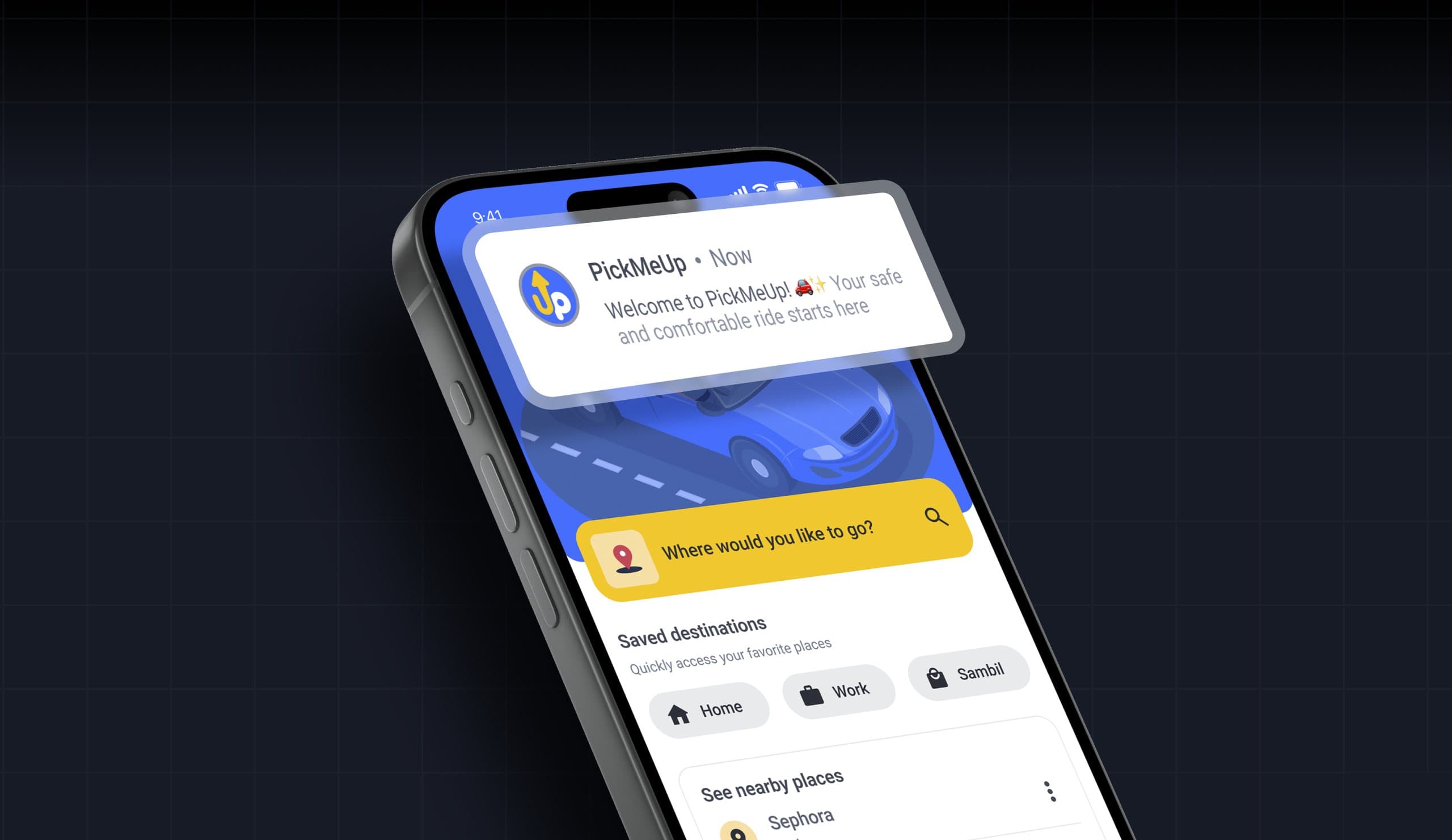
Independent drivers already beat taxis on speed and price in Venezuela, but riders find them through WhatsApp groups or word of mouth, which creates confusion and no accountability. The hypothesis: a quick connection, verified drivers, short waits and live location would move those rides into an app.
Research covered a competitive analysis of Ridery, Yummy Rides and DiDi, interviews that produced the Gustavo persona (a student who waits 15–30 minutes for public transport and does not trust unknown drivers), and card sorting in Optimal Workshop for the information architecture.
Make the next step
the only thing on screen.
02Ride flow
Where to, who for,
where from.
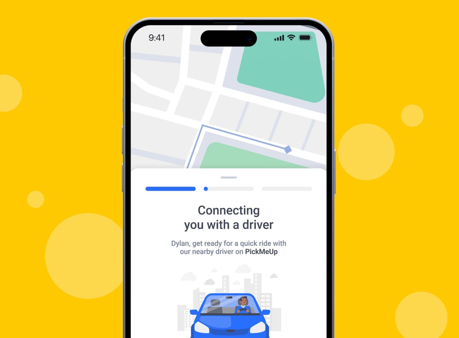
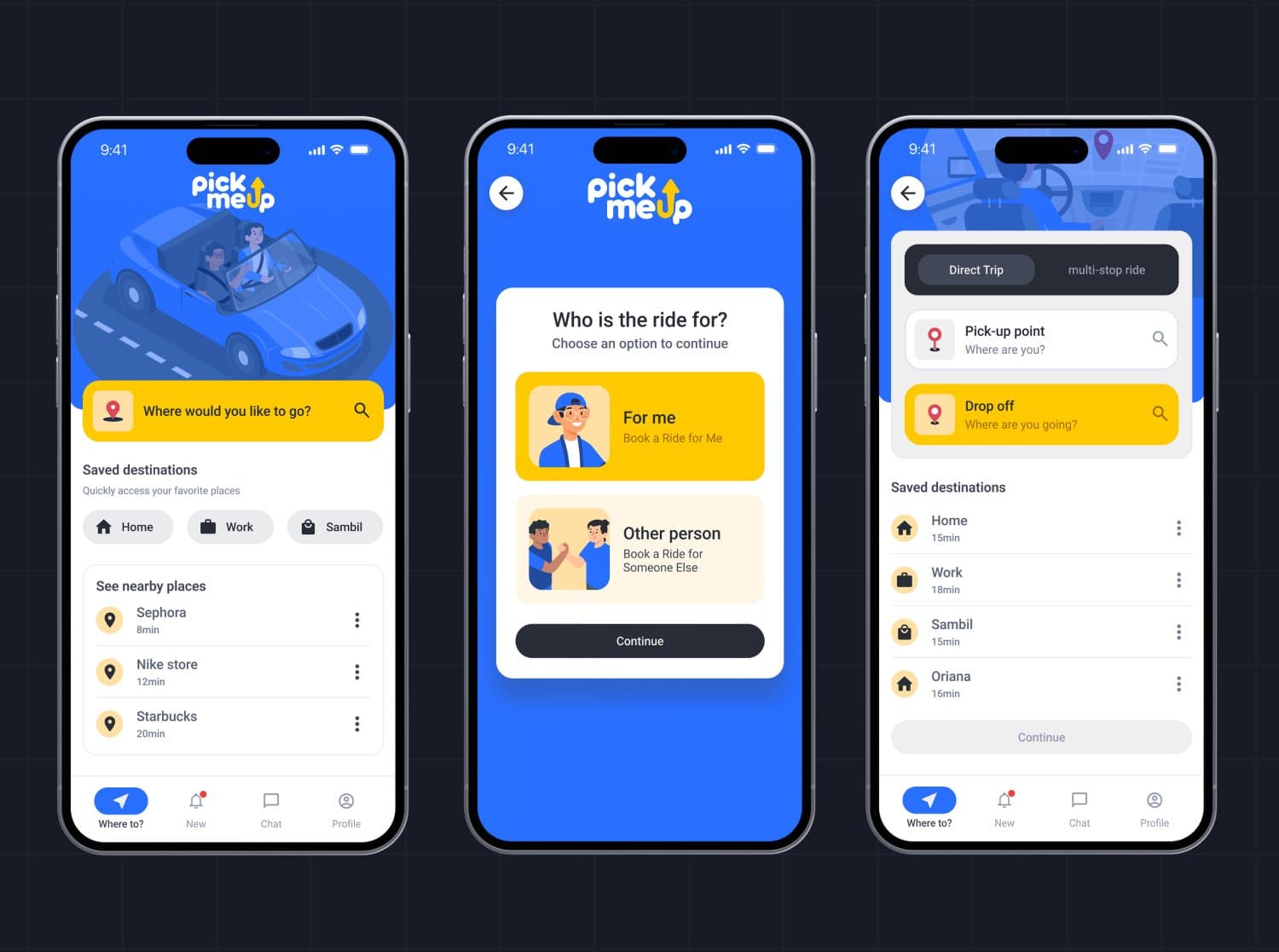
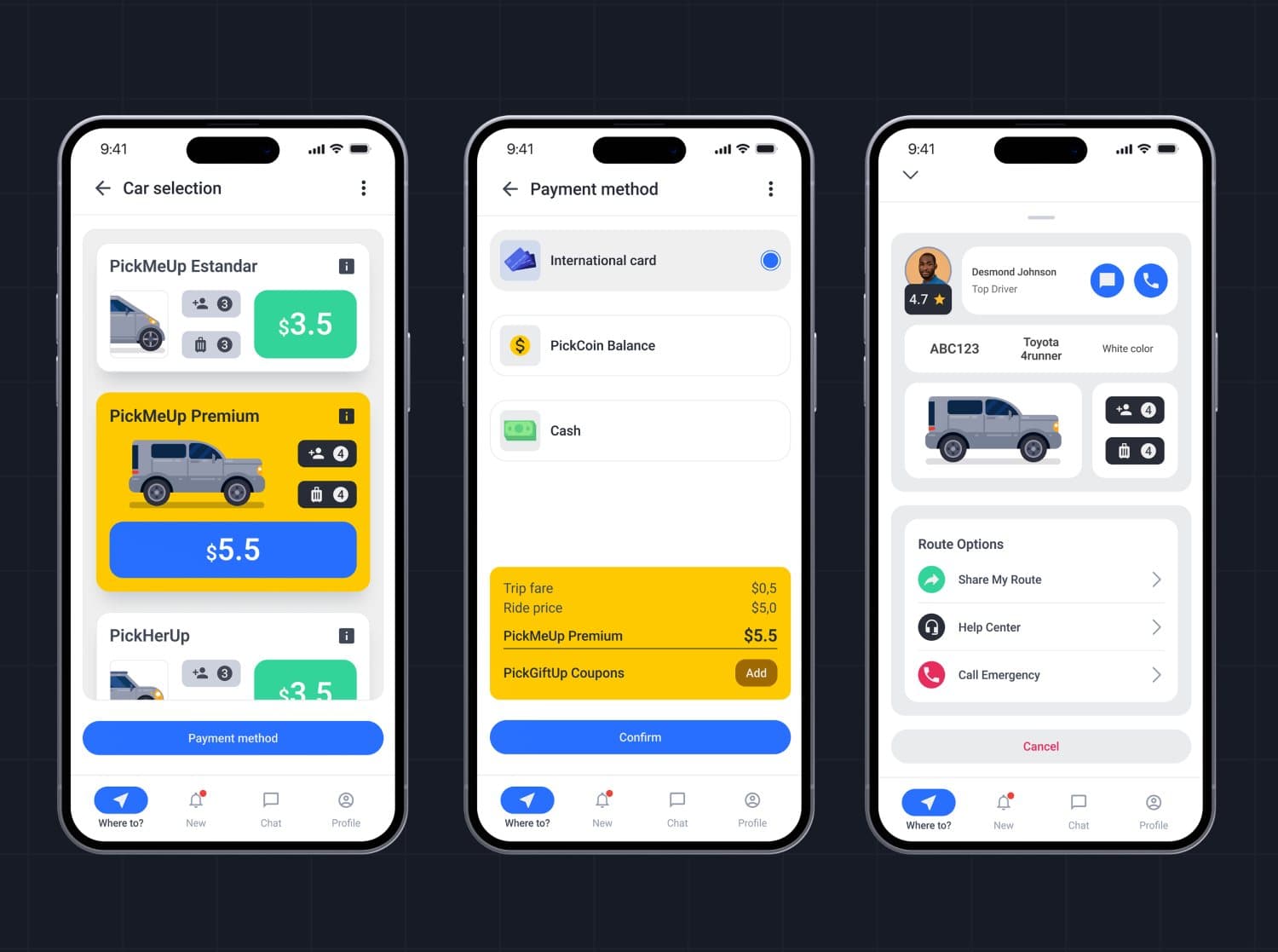
The flow is a short chain of single decisions: destination with saved places and nearby spots, who the ride is for, pick-up and drop-off with direct or multi-stop, then car type, payment and the driver card. Each screen asks one question.
03Vehicle & payment
Price before
confirmation.
Car selection shows capacity, luggage and price per option with the selected tier highlighted; payment lists card, PickCoin balance and cash with the fare breakdown above the confirm button. Nothing is hidden behind a summary screen.
04Testing
Tested, then
rebuilt one screen.
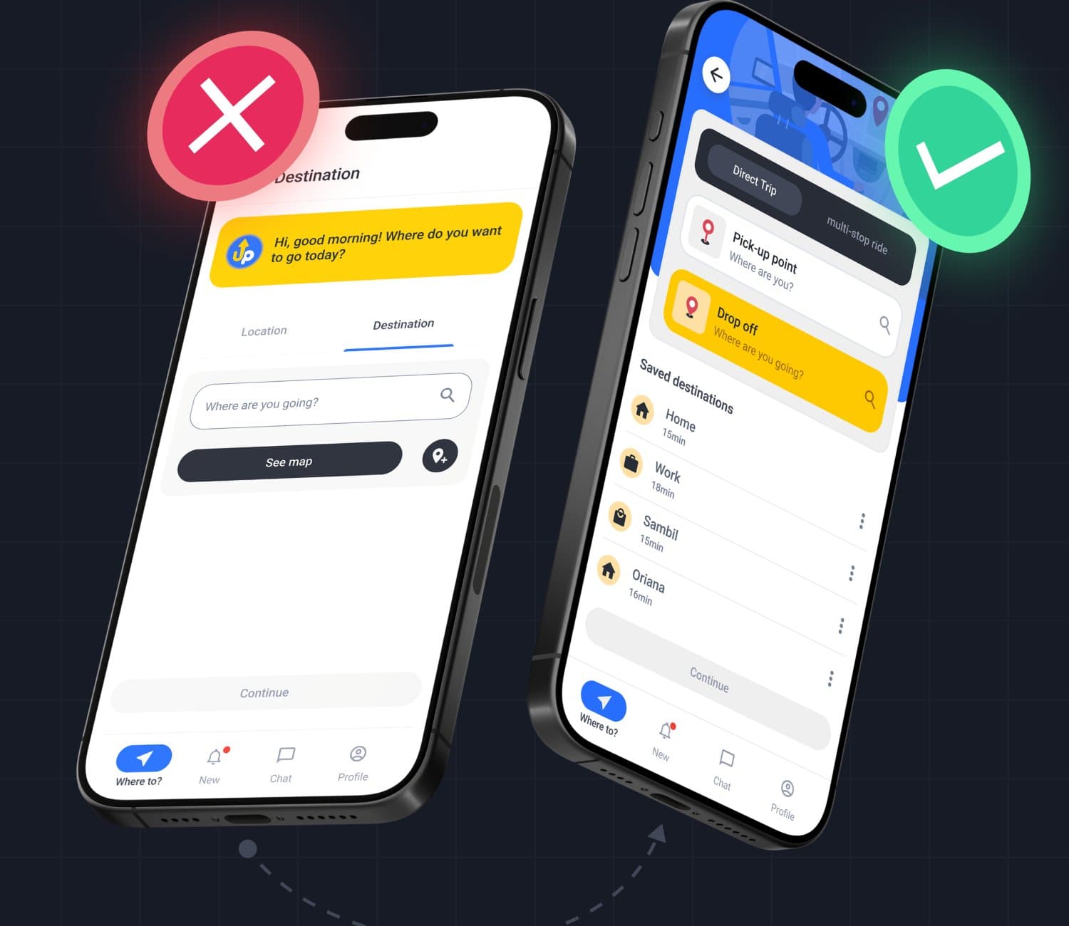
Five tasks were tested with users: select location, destination, car type, payment method and wait for the driver. The destination screen failed most often, so it was redesigned from a tab-based form into pick-up and drop-off fields with saved places visible by default.
05Results
Measured in the
usability tests.
Averages across the test participants after the iteration, taken from the study documentation.
06System
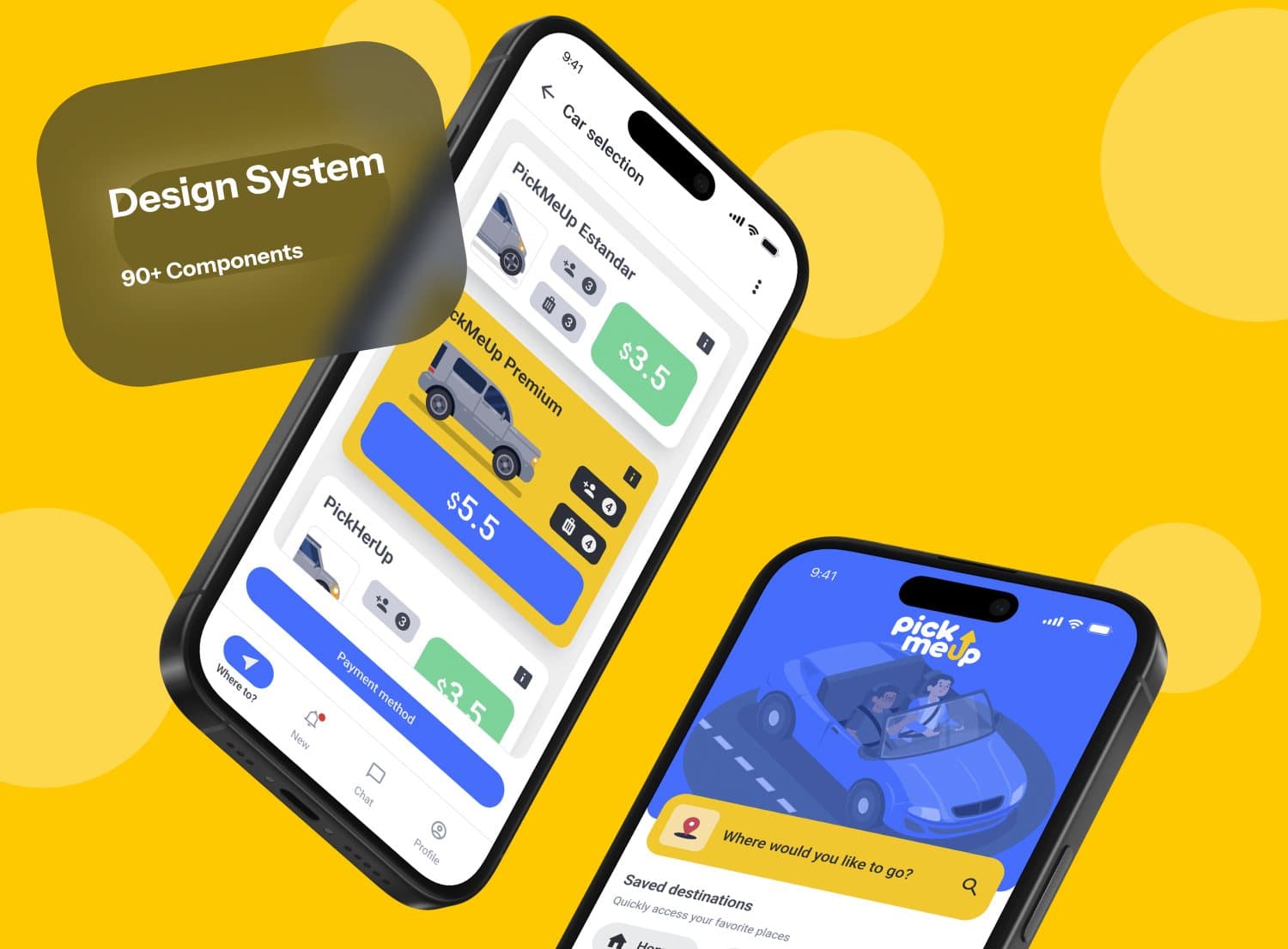
90+ components,
40+ screens.
A Material-aligned design system (Roboto, blue #276EFF with yellow accents) with every state covered, so the 40+ screens stay consistent from onboarding to the driver rating.
Trust is a UI problem
before it is a policy.
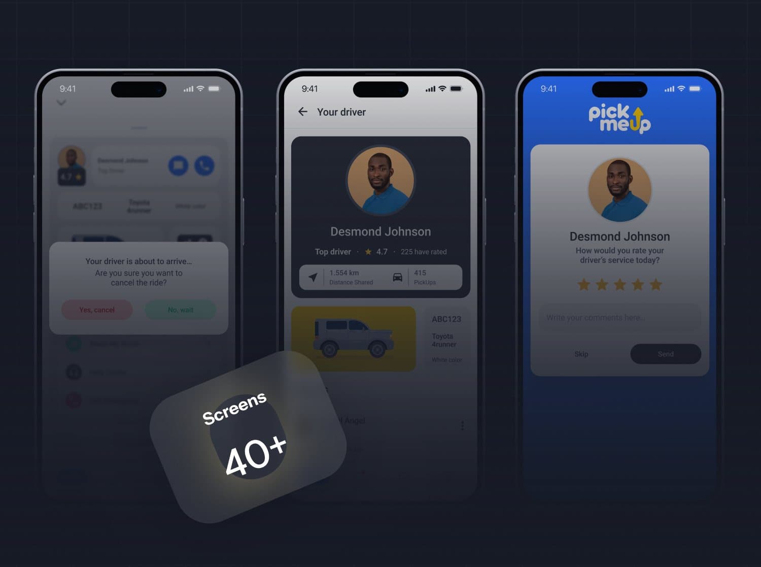
Driver profile, arrival and rating screens close the loop after the ride.
More work
More work.
Same level of thinking.
A broader range of eCommerce, SaaS and web projects. SwipeScroll through, open what is relevant.
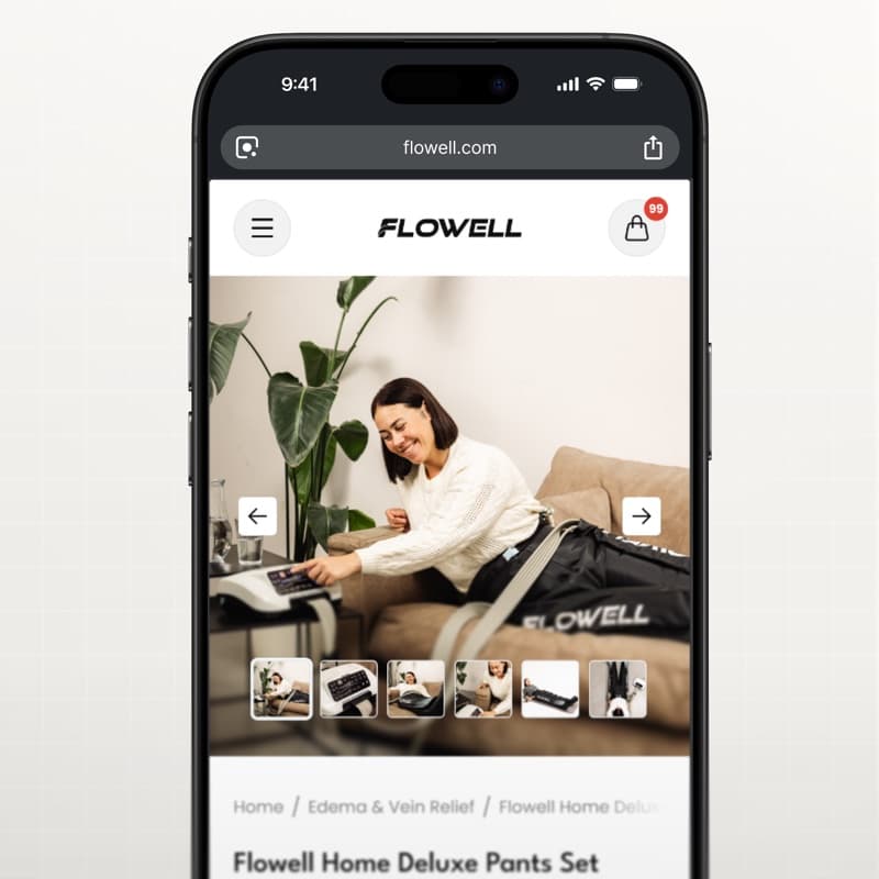
eCommerce · CRO
Flowell — eCommerce conversion optimization
Storefront and product pages redesigned around clearer product education and a more confident path to purchase.
View case study Flowell — eCommerce conversion optimization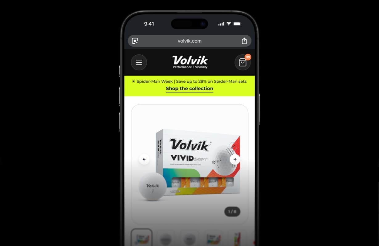
eCommerce · CRO
Volvik — eCommerce PDP redesign & CRO
Product detail page redesign and conversion optimization for a golf brand.
View case study Volvik — eCommerce PDP redesign & CRO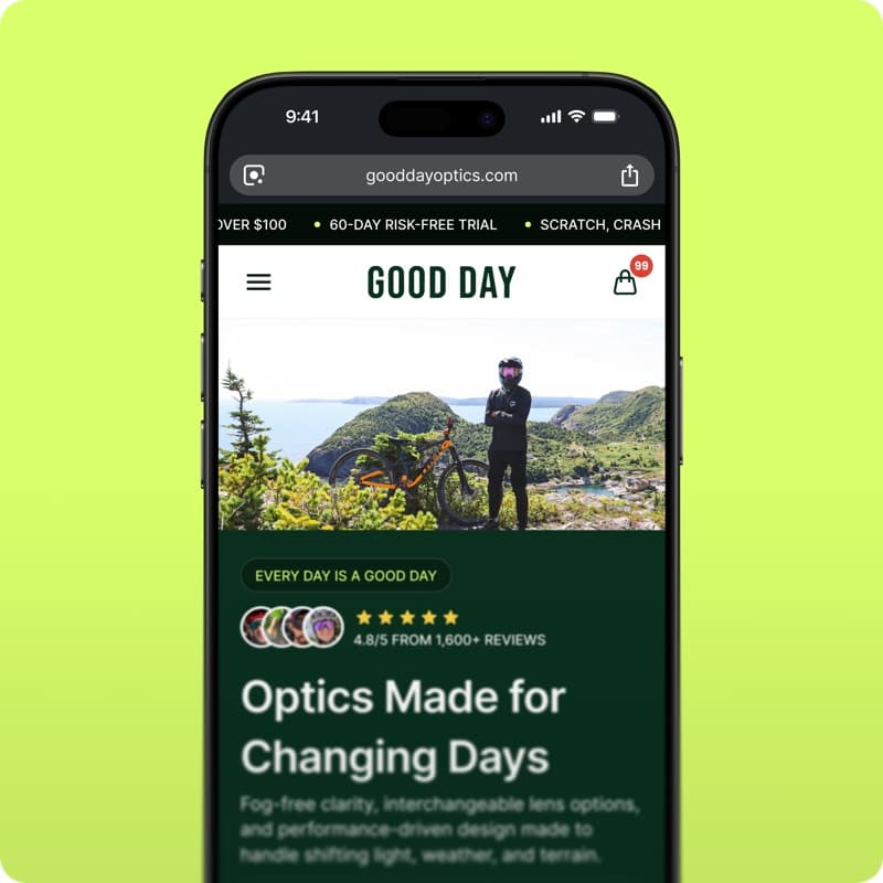
eCommerce · Shopify
GoodDay Optics — Shopify eCommerce redesign
Storefront redesign for an eyewear brand: homepage, collections and product pages built to convert.
View case study GoodDay Optics — Shopify eCommerce redesign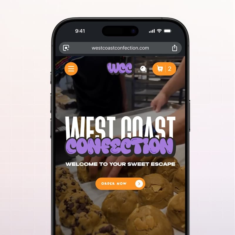
eCommerce · Web design
West Coast Confection — eCommerce website
Playful storefront for a cookie brand: menu, product pages and cart built for quick ordering.
View case study West Coast Confection — eCommerce website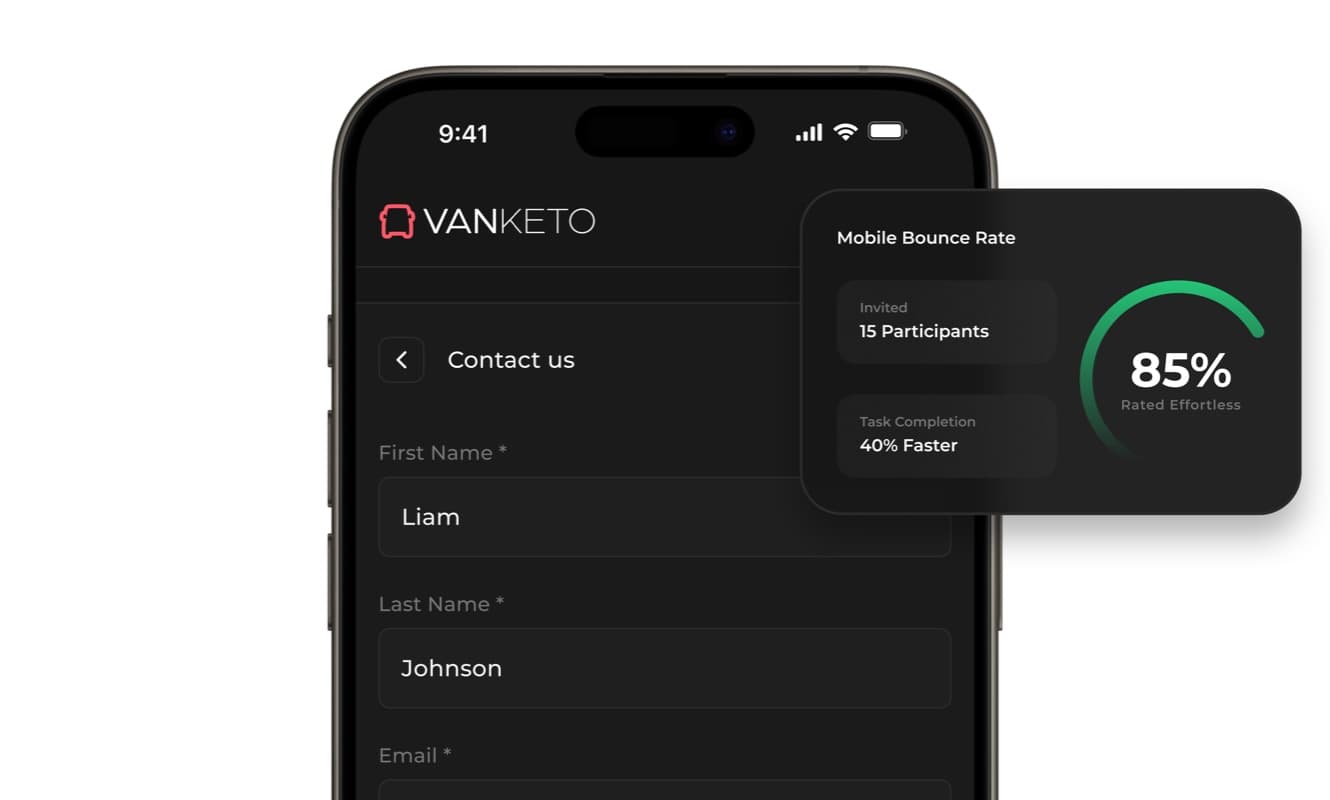
SaaS · Product UX
Vanketo — customer & employee portal
Portal UX/UI for order management: customers track their orders, staff process them, one interface for both.
View case study Vanketo — customer & employee portal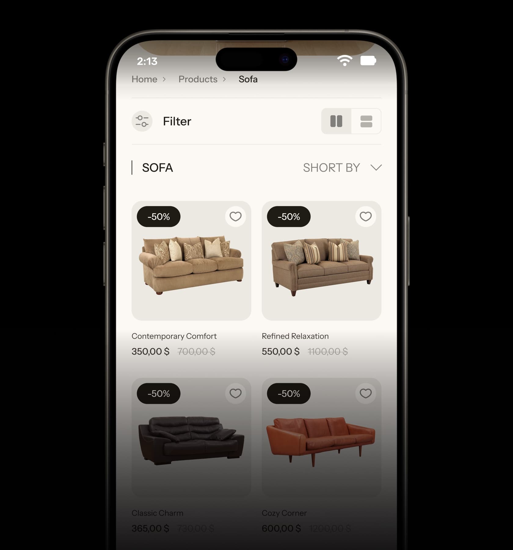
eCommerce · UX/UI
Collections — furniture eCommerce UX/UI
Home, collection and product pages for a furniture store, designed from the phone up.
View case study Collections — furniture eCommerce UX/UI


Have a project with
a similar problem?
Share the product, page or funnel you want to improve. You’ll get a straight answer on fit, scope and timing.
Independent studio — you work directly with Dylan Allynder.